AGIMA Ляпцева Кристина
This work
in other
nominations
UX, UI & Journey Design
Task
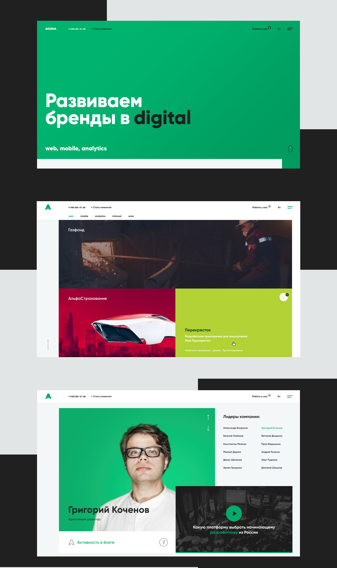
We need to create a website redesign and pay attention to the company's advantages: portfolio and approach to product development.
Ideas and solutions
We had 3 options Option 1 is trendy. It was a concept with serious faces in front and a black background. But that was not about AGIMA. Option 2 is relaxed. This concept had bright colors, big photographs, and weird things. Everything is different. Option 3 - to be like Michelangelo. We've used his approach “take a stone and cut off all that is unnecessary”. We have created a calm version in green. Everyone loved this design. He is consistent and serious. Performance indicators: Comparison of periods 15 May 2019 to 30 June 2019 and 15 May 2020 to 30 June 2020 Unique page views 59689 - 2020 27751 - 2019 Duration of page views 1:52 - 2020 1:27 - 2019 Go to contacts 1201 - 2020 1161 - 2019 Behance https://www.behance.net/gallery/95497433/AGIMA


