Digitory Юлия Суханова
This work
in other
nominations
Websites Design
Task
Update the site design to the new realities of the Agency
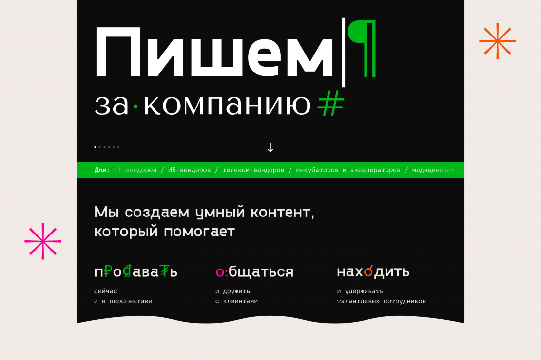
Ideas and solutions
Design: we decided to use the newspaper and magazine style as a basis: we selected the font, added elements of typographic icons (paragraph, asterisk, etc.), chose a pleasant light beige color of the overall design, similar to newspaper pages, and took a large newspaper typography. We had to renovate the old logo. We also made an English-language version, which you can turn on using the “To the dark side”. Unlike the Russian version, it’s made in dark colors. In order to dilute the abundance of text information we used the trend of 2020 — we held a photo session of the leaders of “Digitoria” and added colored details to their photos — hats, collars, sleeves. Functional: We have completely redesigned the site structure, eliminating unnecessary tabs, links and clicks. There is only one main page left. You can find the block you need by scrolling down the page or using the convenient links at the top of the page — "Cases", "Team", "Contacts". There is also a link to the presentation — for those who need more details about the agency.