Brand adaptation and website for Markthomas glassware Toltol Studio
This work
in other
nominations
UX, UI & Journey Design
Task
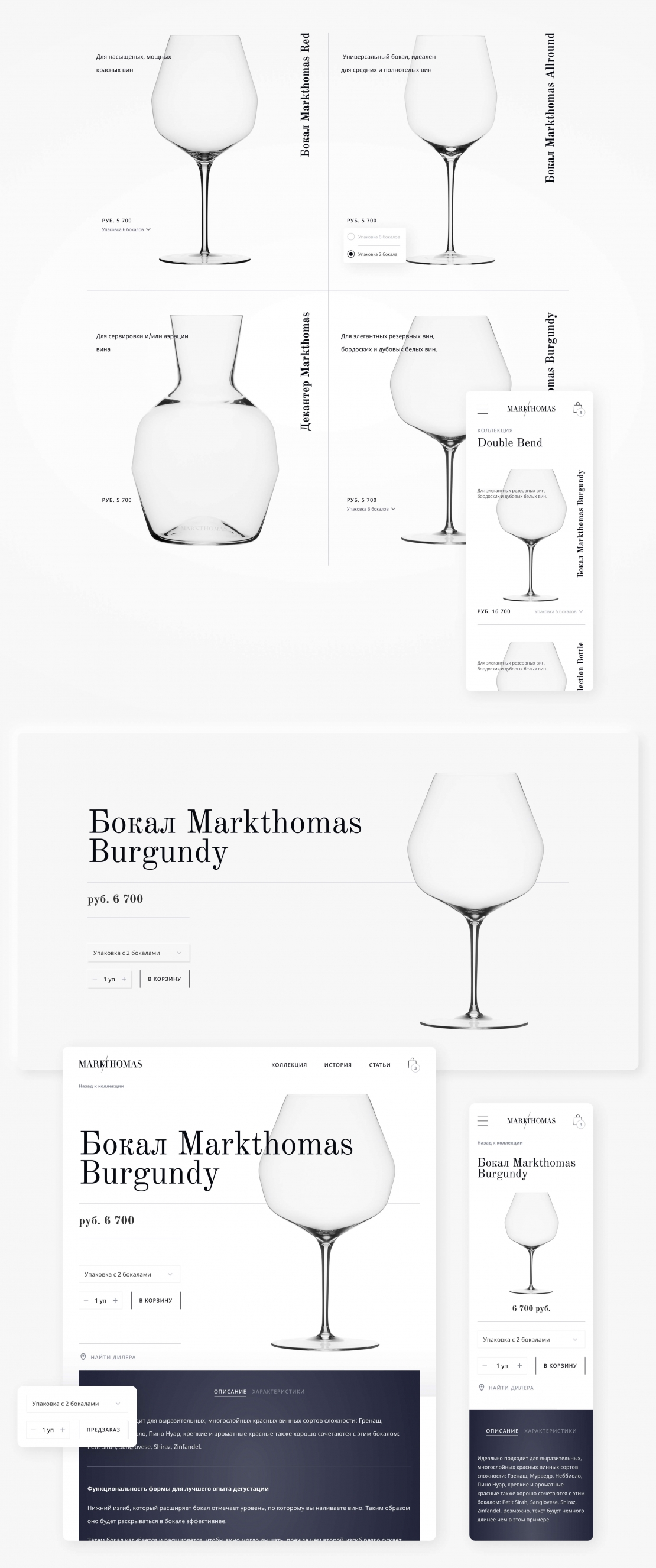
Brand adaptation to the Russian market and website development for Markthomas glasses. The handblown glass market is dense so that we can differentiate clearly in Russia - we have concentrated all our attention on the geometry of the glasses - their uniqueness is not in brightness but functional form. From here the absence of color schemes, the abundance of geometric lines and outline font.
Ideas and solutions
We picked up 2 contrasting fonts - classicist antique - to draw accents with and emphasize the geometry of shapes and the sophistication of the glass, and the second with a smooth and simple grotesque to harmoniously arrange the rest of the information. We added a little blue pigment to the gray shades, making the character of the interface a little colder, thereby adding depth. We collected all the details in the interface for the convenient scaling of the project. Thus, we can develop new pages and functions without disrupting an already developed interface system. Product card Goods are displayed in a large grid of 2 pieces in a row: to see the shapes in detail. We've tried to create the most minimalistic representations of goods so that the emphasis falls on the geometry of glasses shape, and a line indicating the guiding accents in the geometric composition. In addition to all the necessary characteristics and descriptions on the product page, it was important for us to add a photo gallery: photos from real life that shows how delightful the glasses look in the interior. A separate section explains the history of glasses creation because the uncommon shape is not just a stylish - it is primarily a functional solution.


