AQ.Lifecare FREE.creative
Task
Strategy development, identity and website creation
Ideas and solutions
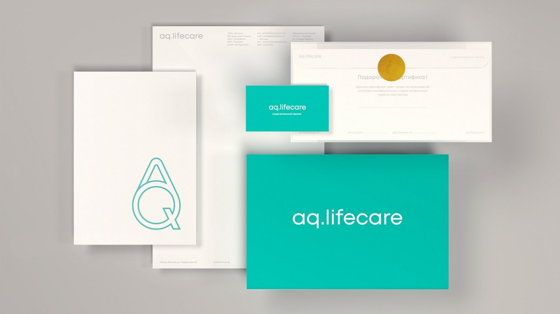
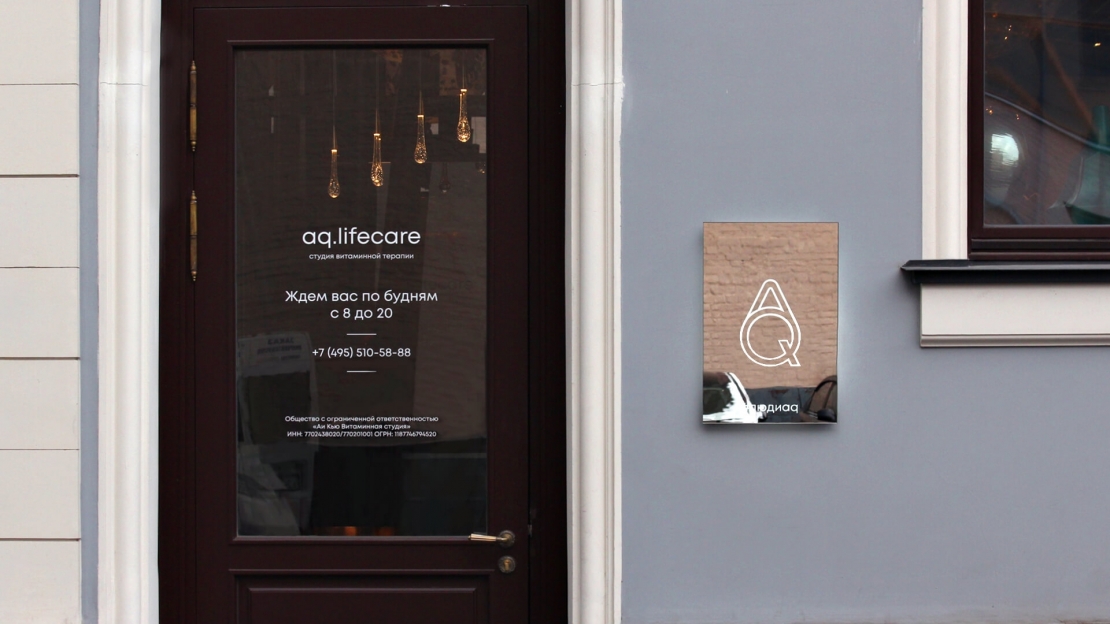
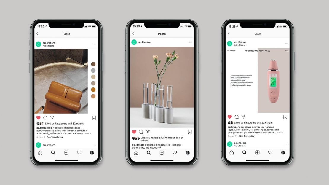
AQ.Lifecare is a vitamin therapy studio that provides services in the field of preventive medicine, which is practically unknown in Russia, but widespread, for example, in Japan and the USA. The essence is to prevent health problems with the help of intravenous injections of vitamin cocktails containing various trace elements in addition to the usual vitamins C, A, B. We faced a difficult task: to develop communication of an innovative product for Russia with an audience in various channels. The client has not yet had a clearly formulated business development strategy, but a facility was chosen in which the interior design project was actively implemented. We started by researching an issue that included an interview with a future target audience. They helped us find two important insights. Firstly, beauty is inseparable from health - if you are beautiful, it means healthy, and vice versa, if you rephrase that, beauty comes primarily from health. And secondly, to understand that health is perceived by modern man as a science. Based on these findings, we proposed the following brand concept — innovative technologies for health and beauty. In visual identity, we reveal innovation and empathy as the core brand values. In this regard, we use a peaceful color scheme, which emphasizes the empathy of the brand — gray color symbolizes balance and tranquility, and the color of the sea wave is naturalness and health. Modern geometric grotesques was chosen for the logo and corporate font to symbolize the modern approach of the clinic. And the layout of communication media such as advertising posters or the website tells about the individual approach in the clinic itself: the plane is divided into two or three dice, thereby adapting to the message.

