Papa John's Website Chulakov
This work
in other
nominations
UX, UI & Journey Design
Task
To redesign the site, to introduce unique features among pizza ordering services, to create an interface that will stand out from competitors, to simplify the process of online ordering, to reduce the number of steps to achieve the goal, to add to the adaptive version of the site.
Ideas and solutions
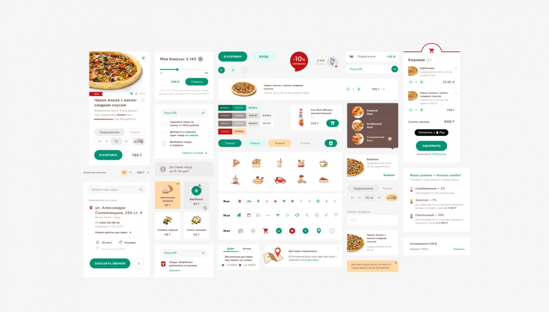
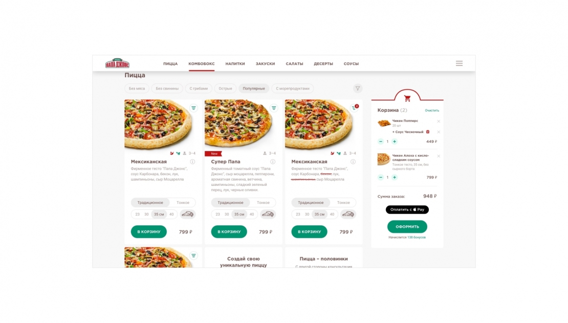
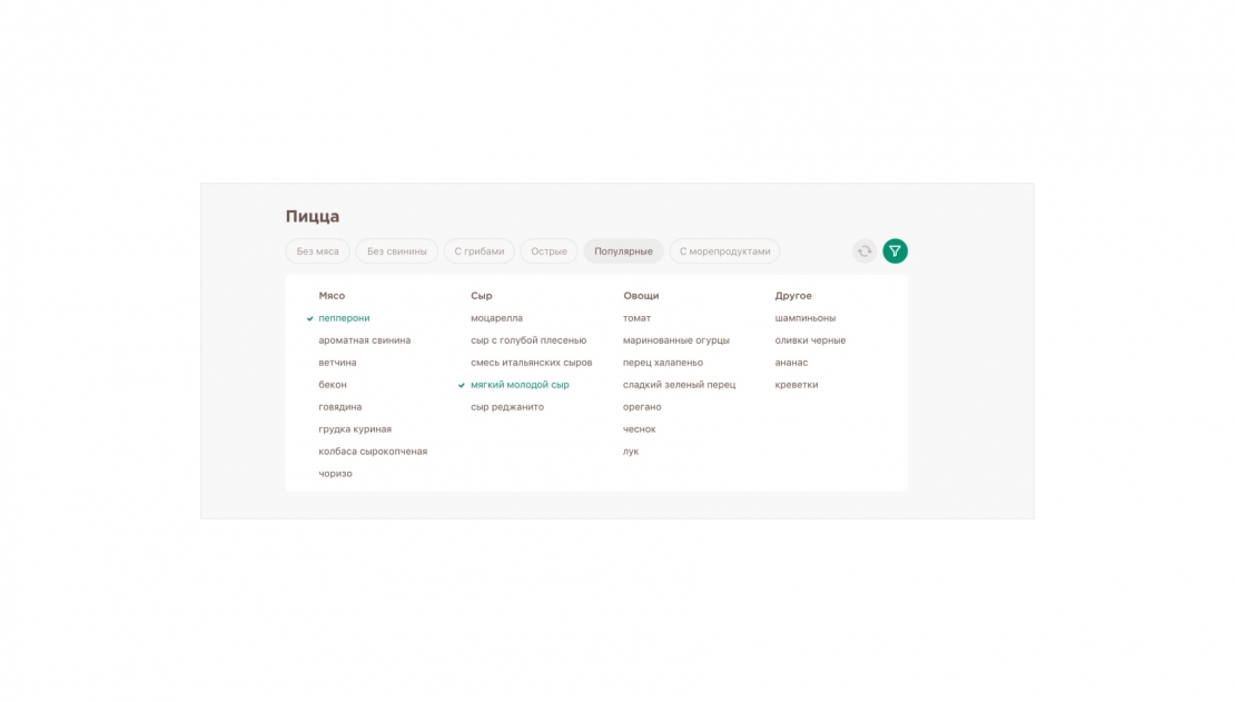
The main needs of the target audience is a convenient and fast order, easy interaction with the service at all stages of registration, the ability to accumulate bonus points or receive cashback. We analyzed the previous version of the site, metrics data and identified a number of obstacles-the site did not look attractive to customers, there was not enough information on cashback and promotional offers, there was a complex ordering process. To work on the project, we created a design system that includes various elements and styles. We analyzed many scenarios of user interaction with the interface: from basic actions, such as choosing a pizza, ordering or registering, to less important ones: the use of promotional codes, the accumulation of bonuses, etc. based on the obtained data, we made prototypes of the site. For easy navigation between sections was added anchor menu. Was fixed cart allows you to proceed checkout from anywhere on the menu page, and constantly shows the buyer how many items he has chosen now. Made a pizza constructor. The user can independently collect it from any ingredients. To work in the designer was convenient; we broke the ingredients into categories. For those who can not decide what kind of pizza you want to order or want to try your favorite pizza and something new, it is possible to order pizza from different halves. For example, half of the pizza is meat and half is vegetarian. In the personal account, all the functionality is located on one screen: the user can view the status of the order, the status of the bonus account and the available gifts without leaving the page


