FrontendBlock Кристина Анфалова
Category
Craft
Nominations
Websites Design
Company
FrontendBlock
Brand
FrontendBlock
Link
This work
in other
nominations
UX, UI & Journey Design
Task
Source data - a site made on a template that does not meet the needs of the business and the user.
Ideas and solutions
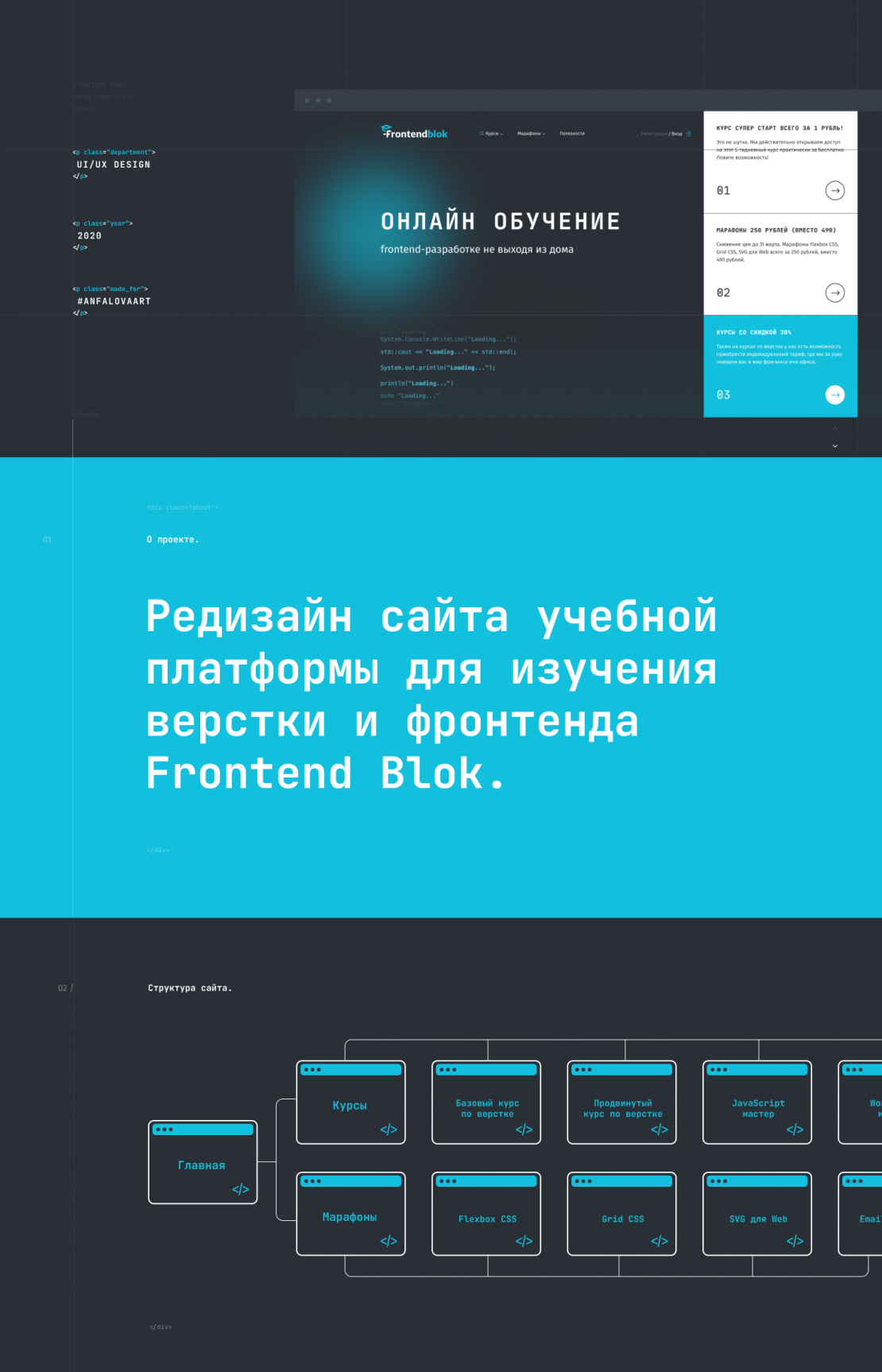
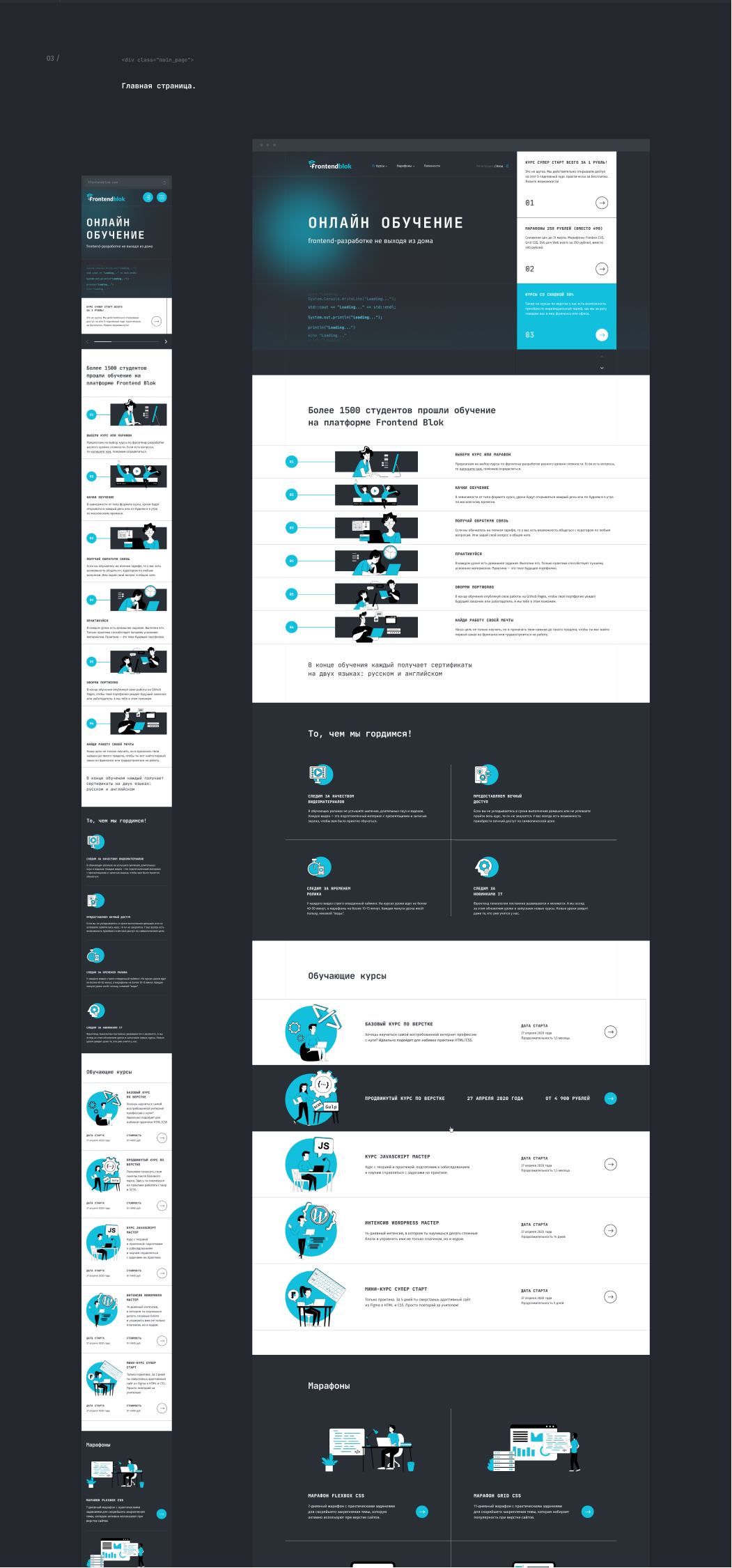
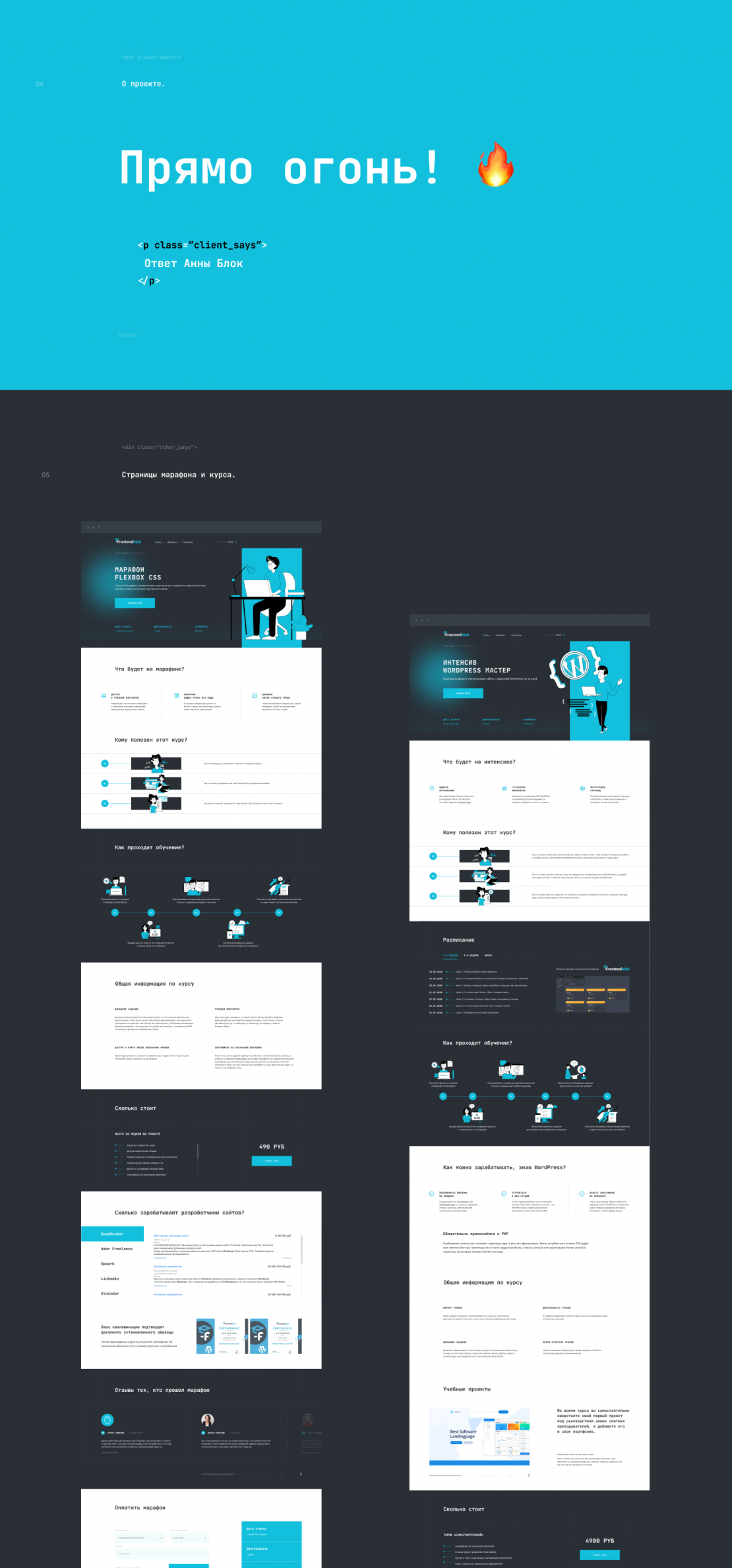
We have redesigned the site structure to make it simpler and more understandable. We highlighted the main advantages of the platform, courses, and marathons. We have developed unique illustrations for each of the courses in a single style. A unique animation on the first screen shows the code - the main work of the layout designer. We also worked on the mobile version. after all, the main flow of visitors comes to the site from a mobile phone. As a result, we made a cool product that functions and brings new students. The site's style was moved to the platform itself, promo materials, and Anna's YouTube channel.

