KAMU KUMA Креативное агентство GreenMars
This work
in other
nominations
Brand Identity
Task
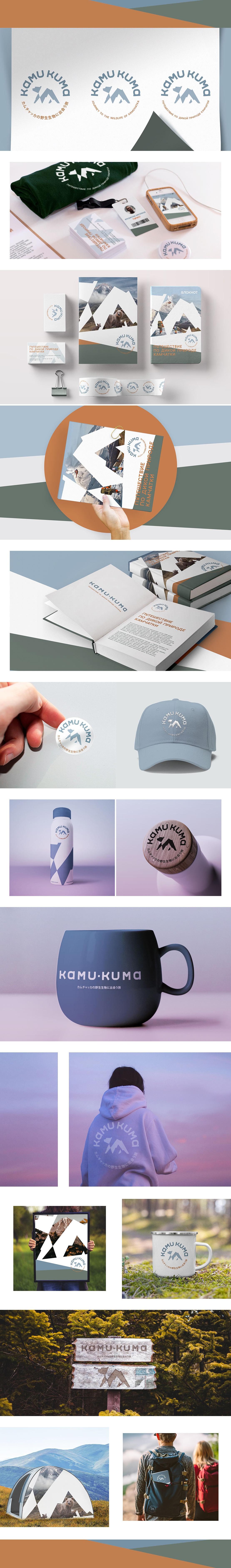
Kamchatka is a unique place for research tourism. A visit to the protected peninsula is a dream come true for travellers from all over the world. KAMU KUMA invites you to discover this attractive world on a new level. To ensure safety, adequate level of comfort, scientific and linguistic support of the tour. Key clients are travellers, explorers and photographers from Japan. Our task was to create the Kamchatka travel agency brand for guests from the Land of the Rising Sun and around the world.
Ideas and solutions
We have developed a system of verbal and visual brand identification. The developed brand name is KAMU KUMA. Two short, playful and rhythmic words. "Kamu" is short for Kamuchakka (this is how Kamchatka is pronounced in Japanese). "Kuma", from Japanese, a bear, a recognizable hero and one of the symbols of Kamchatka. The image of this giant is the basis for further communication of the company Our main character and the Kamchatka landscape are guessed in the logo. The font is selected based on the motif of modern Japanese pop culture. The branded palette is inspired by the very nature of Kamchatka. Coffee hills. Foggy ice volcanoes. Smoky swamps. For tourists from different countries, we have created three language versions of the company tagline: in Japanese, Russian and English. It reveals the value of the company's offering. Travel agency KAMU KUMA is ready to meet travellers in order to open this wild world to connoisseurs of beauty!