Logo and naming for financial company | ─īyrvony Taler NZR Design
Task
The client, whom we knew for years, came with the task to create something really extraordinary: the naming and logo for financial company that could be not some usual clich├® of such business type, perhaps even ironic and scandalous in its philosophy and style. The result really pleased both the customer and us as we had total freedom for our creativity
Ideas and solutions
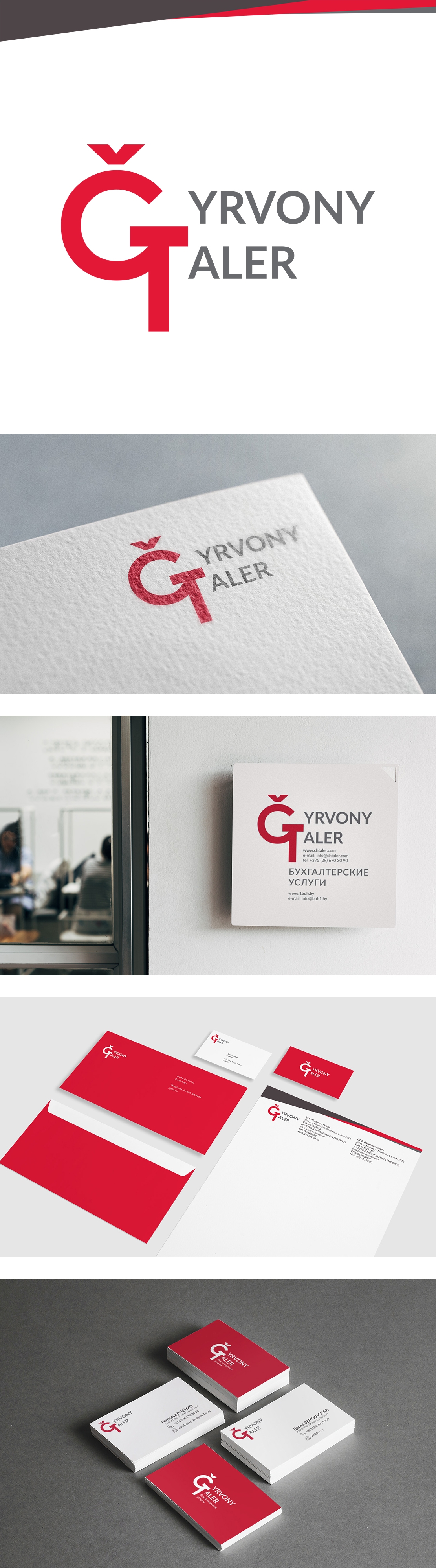
The idea behind the logo is quite postmodernist as it is based on absolutely contradictory historical backgrounds. ─īyrvony Taler is Belarusian for ŌĆ£Red TalerŌĆØ, where ŌĆ£talerŌĆØ (silver dollar) is historical European coin which was popular on the markets on the Belarusian territories in early modern times, while ŌĆ£redŌĆØ during this type in regards to money meant ŌĆ£goldenŌĆØ. And here we have the first postmodernist ŌĆ£anomalyŌĆØ where silver coin metaphorically called ŌĆ£goldenŌĆØ. The red colour and name are also clear historical reference to the socialist movement, same as the hammer and sickle (symbolising union between the peasantry and working-class) which could be easily found in the forms of ─ī and T letters. Here feudal history of the Grand Duchy of Lithuania meets the symbolism of the 20th centuryŌĆÖs socialism and communism creating another paradox in meaning and visuality