Tattoo studio "Studio 168" Хромов Василий
Task
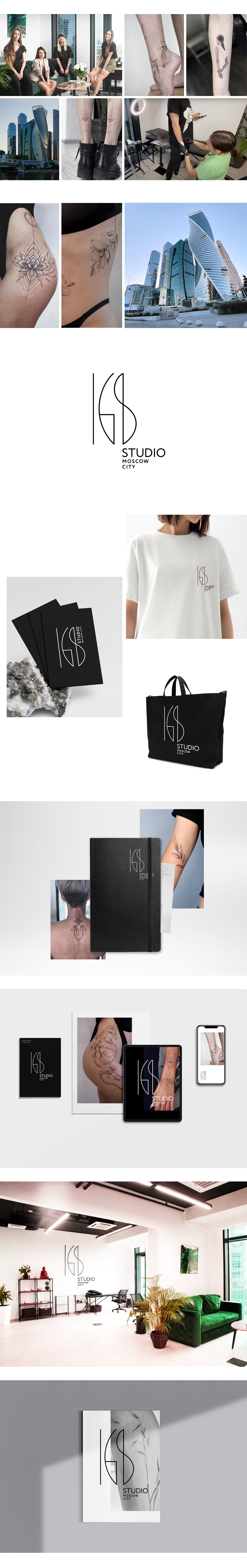
Studio 168 is a tattoo studio located in one of the buildings of Moscow City, specializing in elegant tattoos. The core of the studio's target audience is made up of girls for whom the aesthetic component of tattoos is important. It was required to create a logo that would correspond to the character of the Studio 168 brand, which can be characterized by the following features: aesthetics, expertise, high level of service, elegance, work with body shape
Ideas and solutions
The masters of "Studio 168" while creating tattoos strive to emphasize the beauty of the body, for which it is important not only to skillfully work with graphics and technique, but also to organically combine the pattern and shape of the body, to skillfully work with this shape. The logo managed to combine the key characteristics of the Studio 168 brand, reflecting them through the shape of the signs. The vertical proportions of the 168 characters and the pronounced verticals in them, combined with thin lines, create a premium, solemn and expert image. The signs also contain a reference to the location of the studio in Moscow city. The combination of predominantly vertical elements and arcs of the number 8 in the logo refers to the combination of the verticals of the Moscow City complex and the rotating shape of the Evolution tower in it. The same number 8 in the original rotating design refers to the twists and turns of the silhouette of the female figure. The arcs in the signs are reminiscent of the elegance and beauty of the body shape that is so important to Studio 168