Trinity fashion club Дизайн-студия Мы
Task
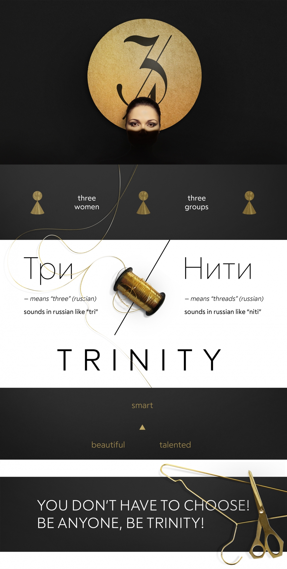
The goal is to develop a logo for the secret fashion club Trinity. The fashion club was founded by the three female co-founders. Each of them has attracted her own target audience to the club, and this connection between the woman and her audience is like a thread. The relevance of the "Trinity" brandname is even more obvious if you go deeper into the Russian translation. "Trinity" in Russian sounds like «tri niti», which literally means "three threads".
Ideas and solutions
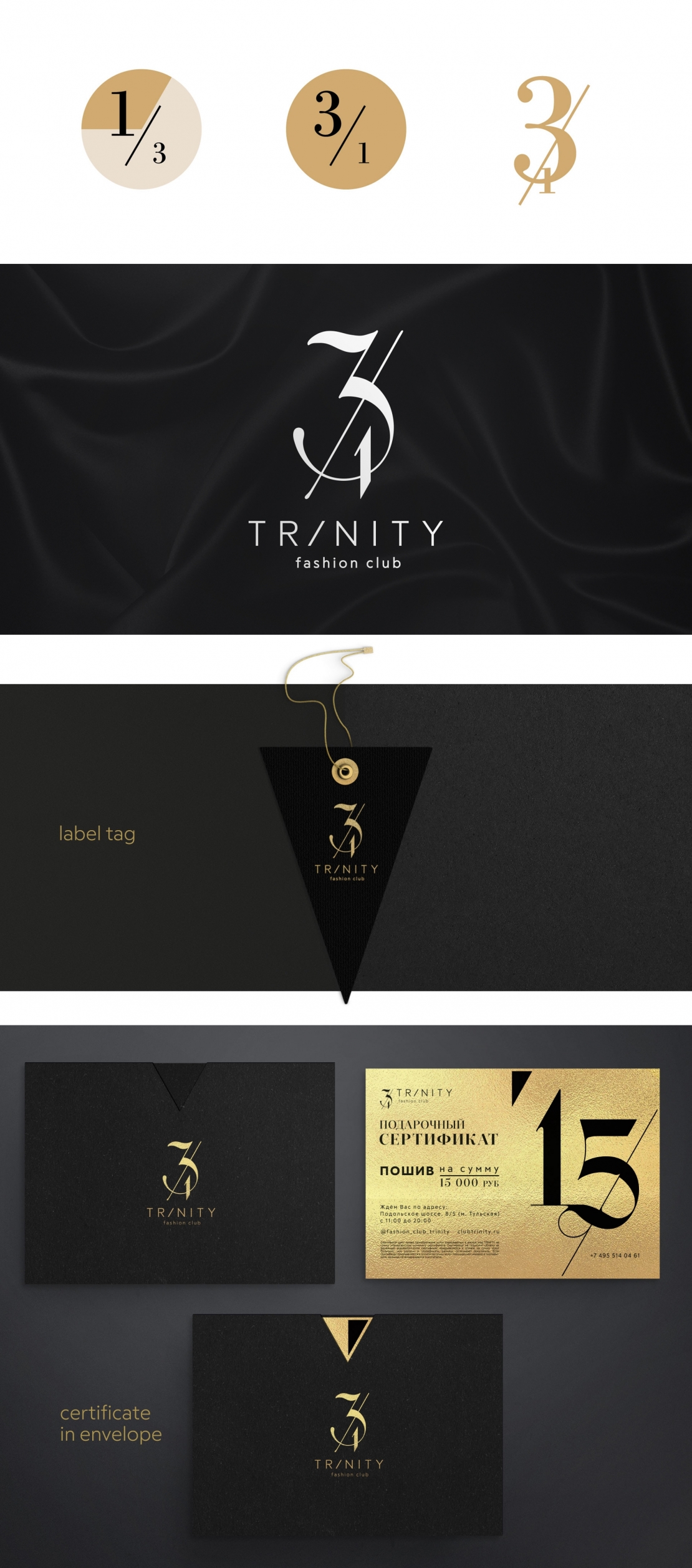
The brand tells you need to be free from stereotypes. A woman doesn't have to choose whether to be beautiful, smart or talented, she can be everything, be Trinity. This is not a new idea. In Ancient times the Man who is beautiful in everything was praised. The antique metaphor about the Three Graces also fits the Trinity brand. Each of the these three graces is the one-third. But together they are the three ones. It's like a nonexistent fraction. The "three ones" is a lexical game in Russian, it's both a nonexistent fraction and the three leaders. And this fraction has become the brand's logo.


