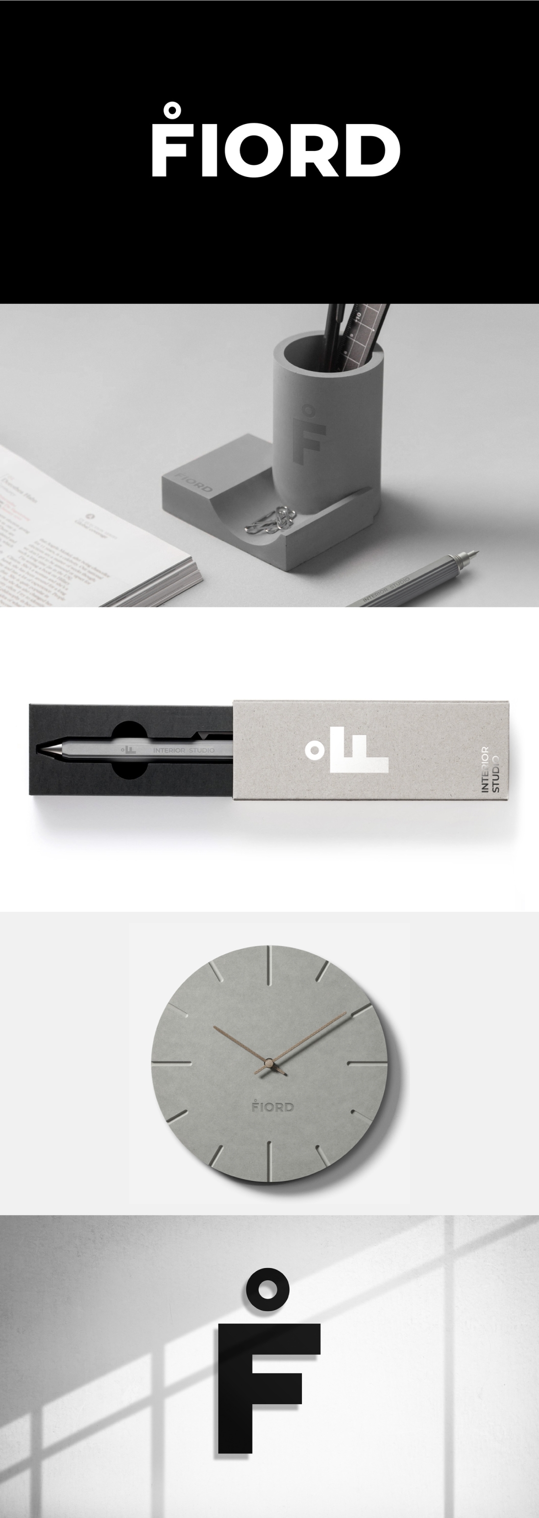
Logotype for «Fiord» interior studio LINII
Task
15 years ago Dmitry Davydov opened an interior design studio under his own name. Most of the projects were related to the interior design of restaurants and private apartments. Lack of systematic promotion made it difficult to communicate with existing customers and reduced the influx of new customers. Studio decided to make large-scale changes in both the business model and the promotion strategy at the end of 2019. New positioning in turn led to changes in studio's name and corporate identity.
Ideas and solutions
We suggested naming the architectural part of the project as FIORD. This name looks stylish, modern, very European. Before starting developing a name, naming specialists got acquainted with studio’s projects. They were distinguished by the strictness and purity of execution. The name FIORD was born due to associations with the ascetic and breathtaking beauty of the Norwegian fjords. This image supports a strict and concise logotype. The interior studio, which was decided to devote to a separate division, was named F–Interiors. The logo is based on the letter F with Dot (Letter F With Dot Above Symbol, Ḟ), visually referring to the European and Scandinavian alphabets. This letter is available in some keyboard layouts, however, it is not currently used directly in any language.


