Leeto Мария Шайхутдинова
This work
in other
nominations
Brand Identity
Task
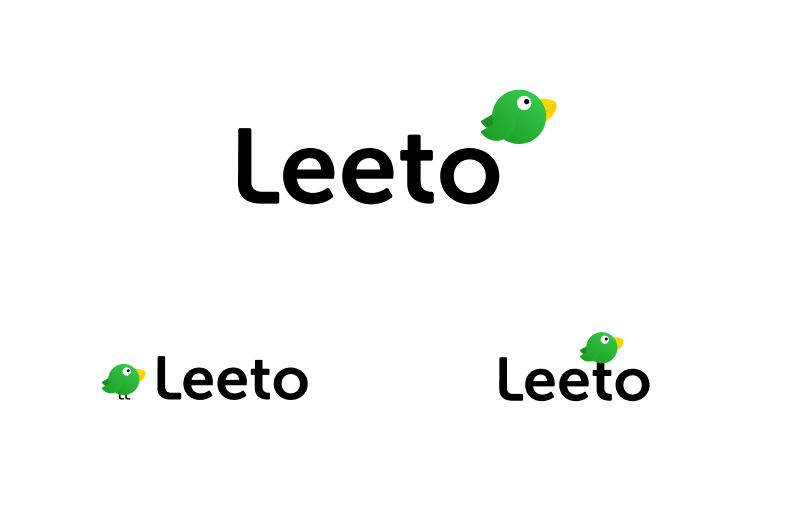
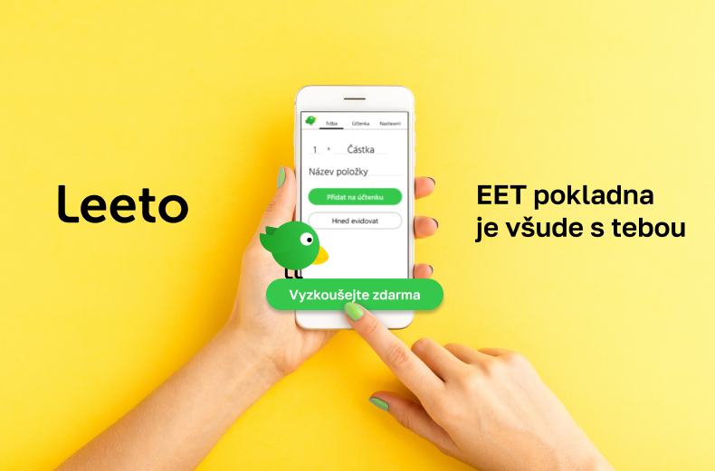
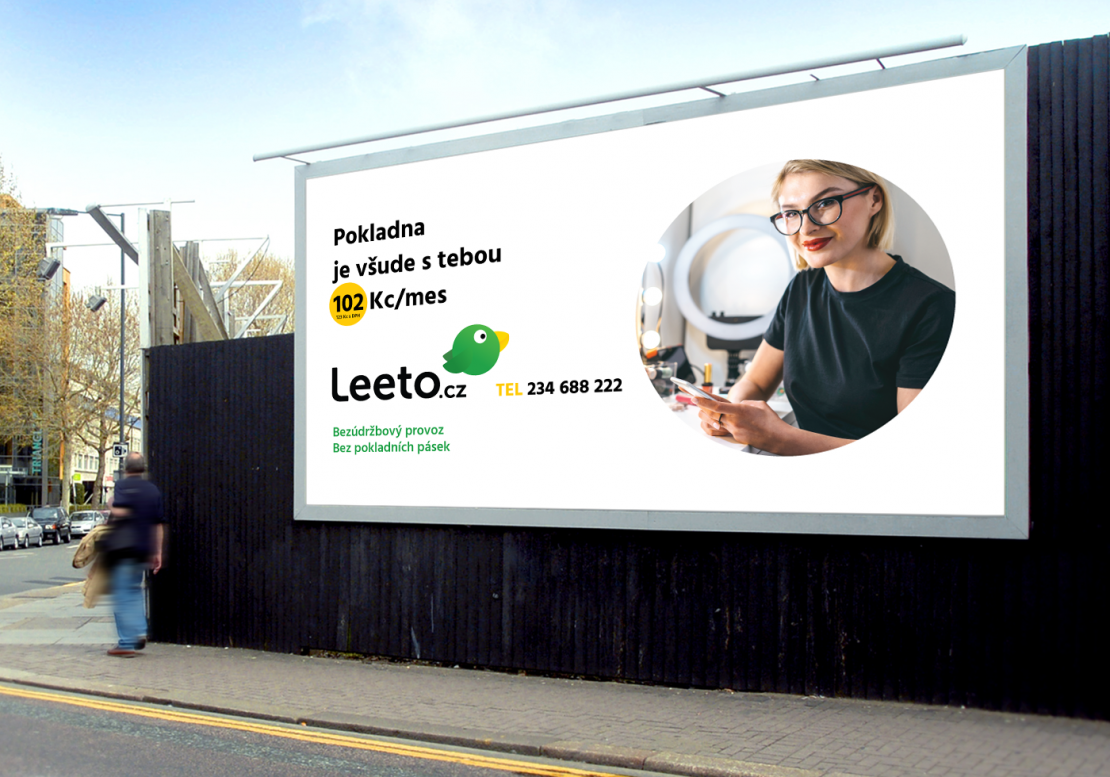
Logo and visual identity for online-service. Leeto is a startup kicked off at the beginning of 2020. It gives small entrepreneurs an amazing opportunity to have handy online-cashier on their phones, tablets or laptops.
Ideas and solutions
The key use case for Leeto is every day using it as an app on your phone. So a nice icon would be really appreciated for brand power. The graphic sign will be used more often than the wording part so I draw more attention to it. Among all associations in the mindmap, I felt potential in a bird combined with a coin. There are several reasons for this decision: — The main target audience of Leeto is self-employment folk who move from one client to another client the whole day long, like a nimble bird flying from one tree to another. Cute and kind symbol of this active lifestyle. — Our clients usually get their payoff in cash and not only banknotes but coins as well, cause it's about some common and not expensive service like plumbing, hairdressing, etc. — The word "leeto" has a connotation with the word which means flying so a flying bird is a combination of all these meanings. So I came up with a green birdie with a coin-shaped body. This creature was invented not like a static sign but as a nimble character. She can fly over the logo, stand next to, or sit on. Her legs repeat the shape of the letter L in wording. Various situations in UX are accompanied by a supporting and encouraging birdie. She's sad when something has gone wrong, jumping for celebrating completion, flying during processing, and gives you a coin when you successfully have sent a bill to a tax office Detailed description https://mashign.ru/leeto


