Altayvitamins Pharmaceuticals packaging conception Egorova Maria
Task
The Altayvitamins company is one of the largest Russian pharmaceutical companies producing effective, safe and affordable products. The range of the company includes about 100 names of medicines. An important task of the brand and packaging is to broadcast the company's image and successfully detach from competitors. Legislative constraints and the natural industry and product boundaries narrow the tools for working at the packaging level, thereby making this task more complicated.
Ideas and solutions
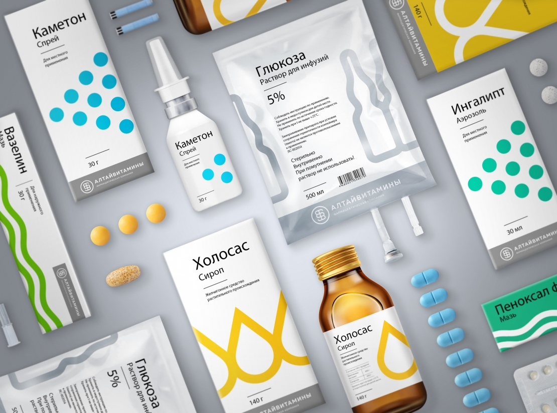
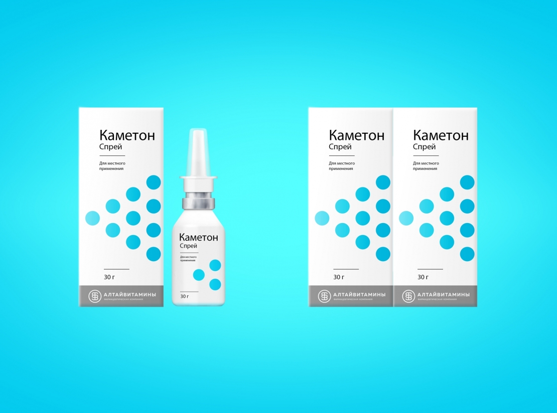
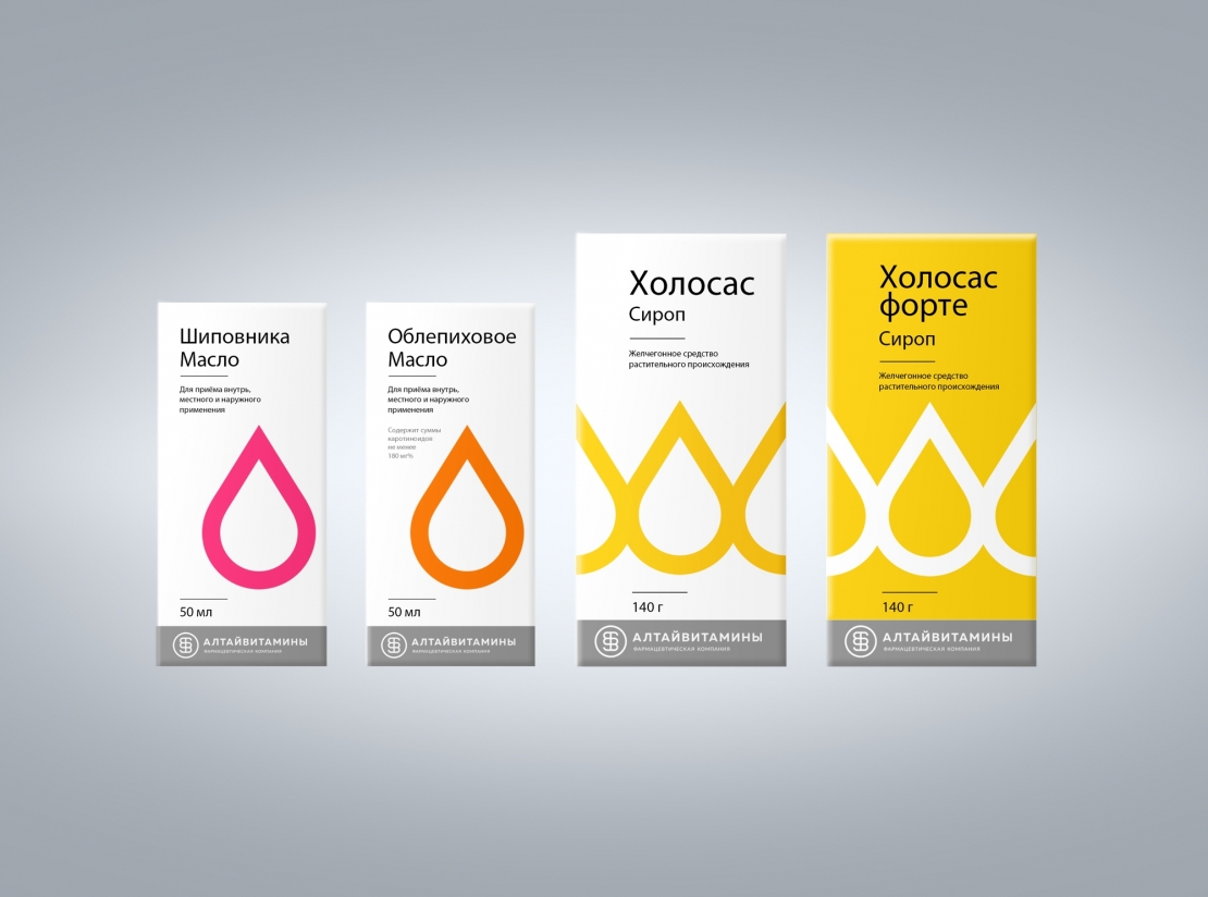
We have identified three main criteria that pharmaceutical packaging must meet. Firstly, the design should be based on a recognizable, but easily replicable corporate element. Secondly, the graphic concept of the packaging should be understandable to a wide audience: both end consumers of various ages and pharmacy workers. Thirdly, there should be a noticeable company mark embedded in the packaging. The graphic design of the packaging is based on a large symbol that identifies the form of release. All symbols are made in the same minimalistic style, which easily unites them into a recognizable system, which is also supported by a uniform layout of the elements on the package. The symbols are located on the packages in such a way that the packs placed side by side form a single large pattern. Such a bright spot of color makes the packaging stand out well from competitors for both pharmacists and consumers. In addition, the packaging design uses universal principles that can be easily scaled to any format, which is very convenient to use and does not limit the product line. For dividing drugs into groups for some of them, color coding is additionally used. The selected gamut is associated with each of the categories. Aerosol products use blue-blue shades, ointments and gels are green, syrups are yellow-orange, and infusion solutions are gray-silver. Forte preparations with an increased dosage of the active substance are colored inversely - with a colored background and a white pattern. The general image of the packaging, on the one hand, is bright enough for the pharmaceutical category, and on the other hand, it is quite minimalistic and light, in keeping with the spirit of the times, informative and understandable, including for a younger audience.

