Doula Lilia Shapiro Дерябина Наташа
Task
Doula Lilia Shapiro accompanies a woman during pregnancy and childbirth, advises her after the birth of a child, helps to improve the life of parents with a baby and conducts training for expectant mothers. During her work, Lilia has already helped about 300 babies to be born. The main task of the brand ID was to convince the expectant mother that with Lilya she is in good hands and with her she'll have a calm.
Ideas and solutions
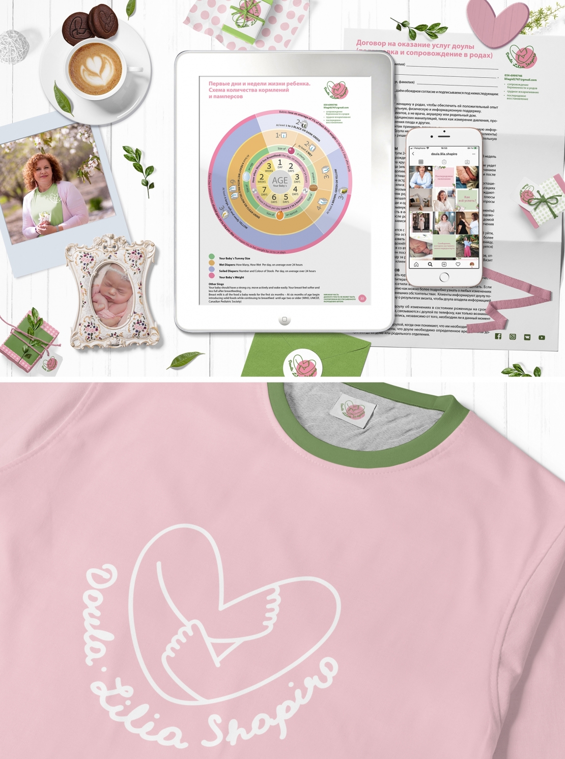
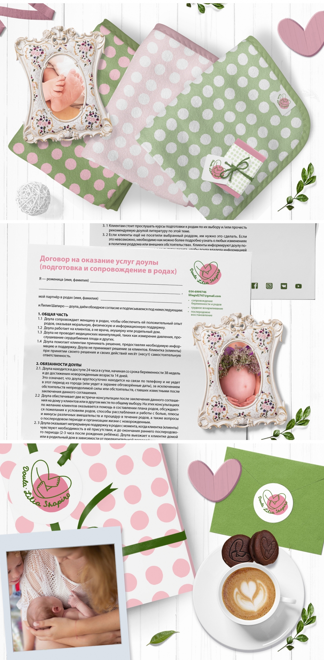
The brand identity is based on warm, natural and "feminine" colors pink and green and their shades, a heart sign and a pea sign from the doula logo. The Pea is generally a very metaphorical symbol. This is a pregnant belly, and an image of a child in the womb, and a dot as a starting point. The pea served as the basis for the creation of a pattern, which is easily applied on various media and makes the style unique and easily recognizable. Thanks to colors, patterns, photo style and typography, and, of course, the quality of Lilia's services, her inner strength and charm, our target audience (expectant mothers) has a feeling of calmness, confidence, security, gentleness and care.