TIMERMAN Winter Season Corporate Identity: rebranding Ахметова Регина
Task
Creating an easily recognizable corporate identity for the TIMERMAN winter season.
Ideas and solutions
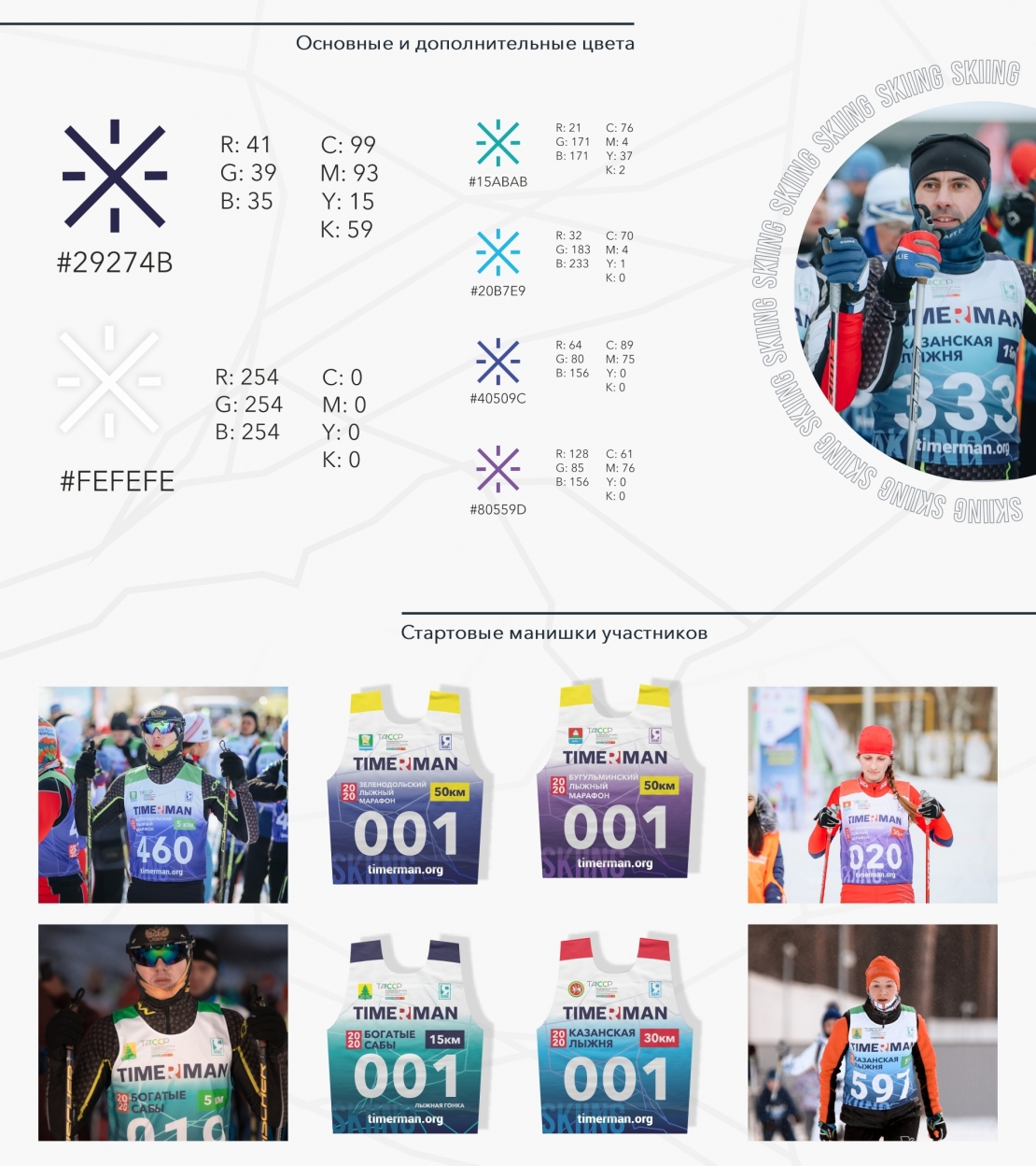
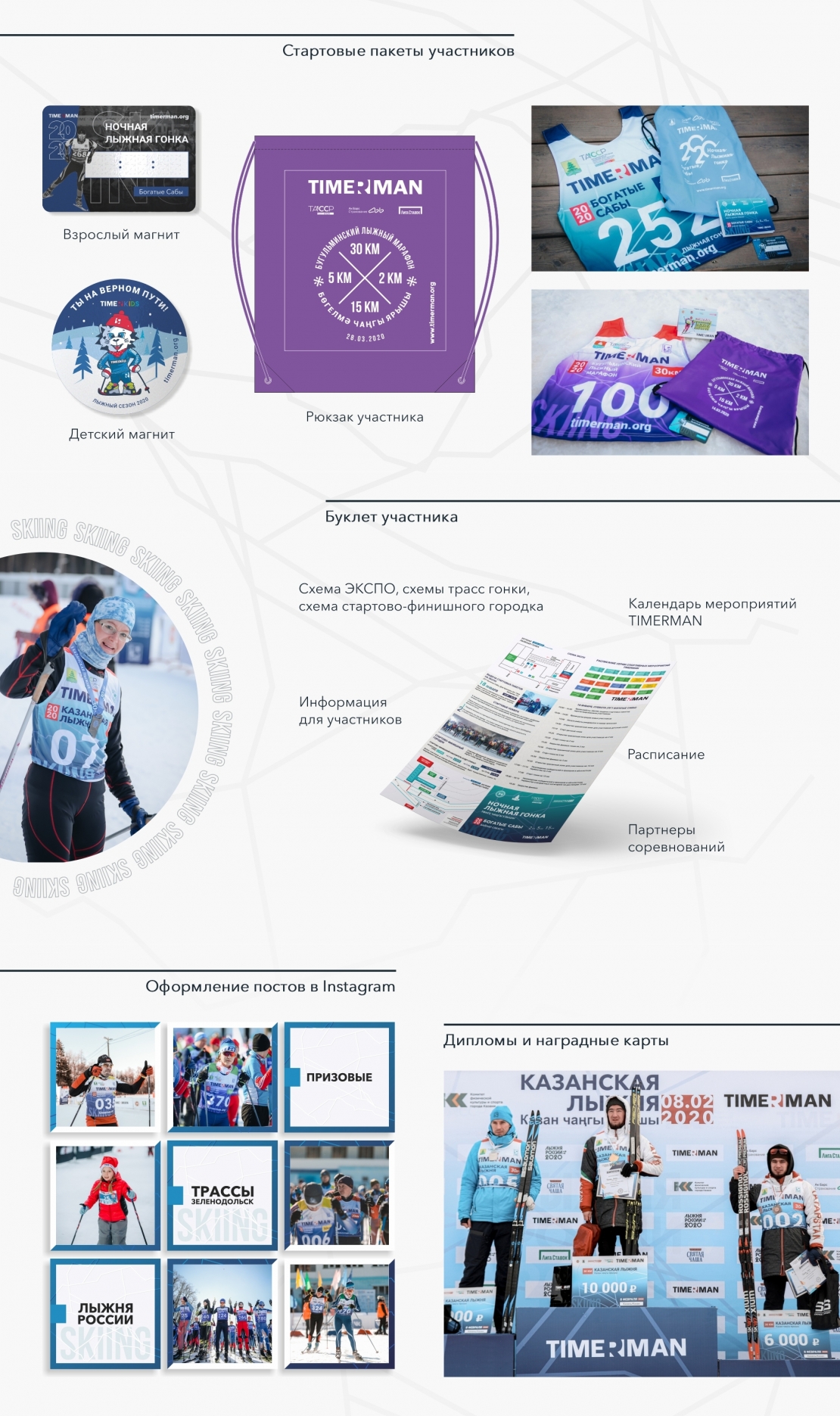
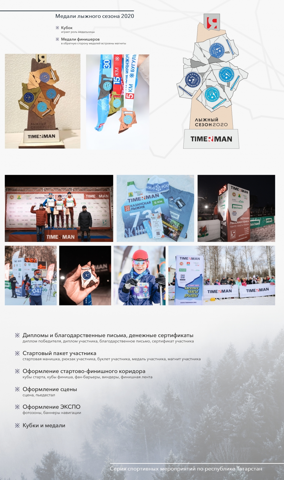
TIMERMAN sports events brand organizes races for sports fans and sportsmen. In 2020 TIMERMAN winter season 3 ski races and a biathlon were held. Every TIMERMAN event has its own identity and branded materials which are presented to participants. A series of winter starts is not an exception. We created an understandable user-friendly design for the handouts, venue decoration and social media. The main idea of the whole winter season corporate identity was to use one of the 4 elements that associates with winter - ice. Snow and ice can be seen on all of the corporate identity materials, white and blue colors as well as their shades are the major ones. The colors and gradients show the range of winter weather types and look good amidst snowy fields, giving some winter season cheer. Medals and the cup play a key role in the identity. Every medal is one of the pieces of a big ice formation. Putted all together they reflect a conquered water element. Numerous cracks on medals represent the strength and hard training of sportsmen. Social media design highlights the winter season among others and creates a cohesive greed that perfectly goes together with winter photographs. We created a corporate identity that established a coherent picture of the winter season races. All the details refer to the winter spirit and unique Russian winter weather.