The video concept for the CRM-system interface Горбаров Илья
Task
We aimed to make the concept of a CRM-system interface for marketing communications to promote it to the USA market.
Ideas and solutions
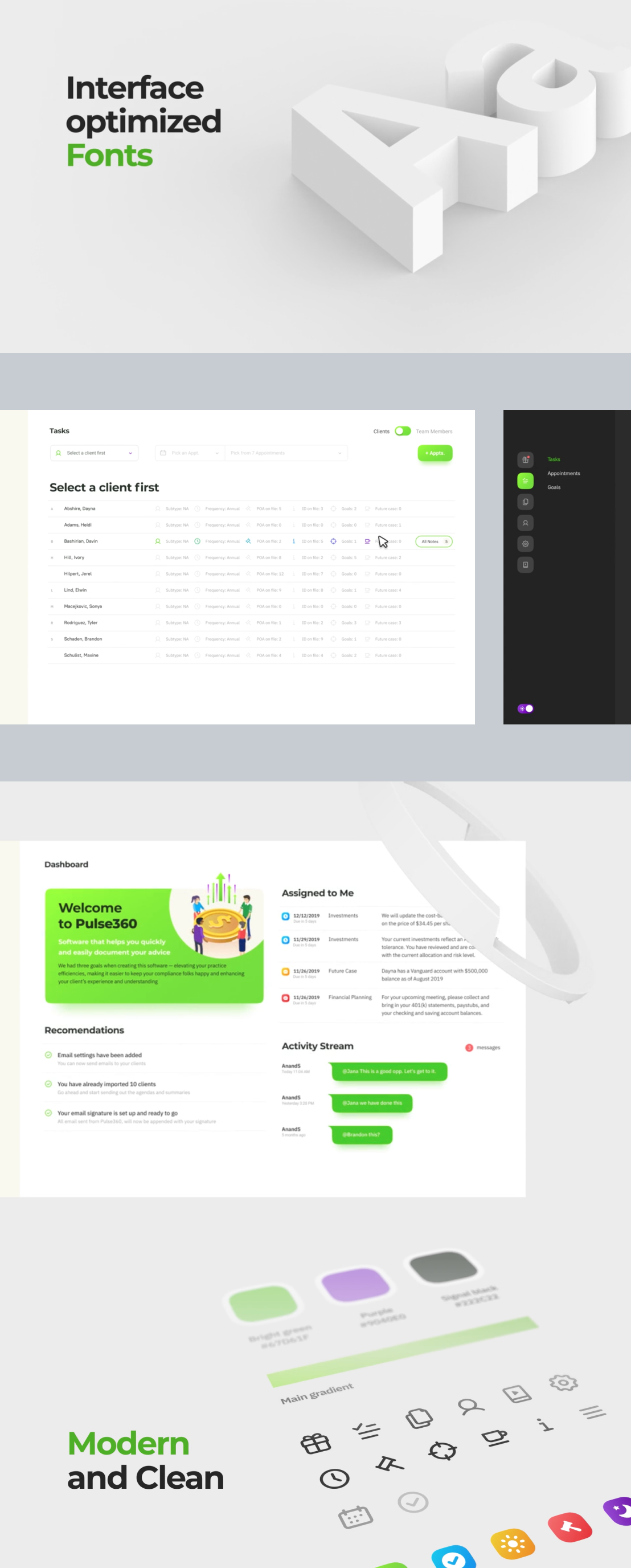
The concept shows how a CRM system interface can be improved to meet the newest design trends and become more user-friendly at the same time. First, we explored one of the most popular US CRM system, then we developed the interface, and put together a motion video to present the team's skills in advertising after that. Our designers tested the demo version of one of the American CRM systems by going through common user scenarios. We found gaps in UX and came up with solutions based on UI trends. To begin with, we excluded the so-called Zero Data Screens. These are screens with no useful information containing a call to action. For example, a user wants to see all contacts with customers for the last month. He clicks on this section and gets to a blank screen with an interface text "choose a client first". These screens waste users ' time which is incredibly annoying. So we got rid of them first thing while elaborating UX-structure. As a result, a clean and user-friendly interface was made: - Minimalistic style will not distract users from their work. - The interface optimized fonts are not eyed tiring and are easy to read at any screen resolution. - A dark theme will allow a better focus on information.