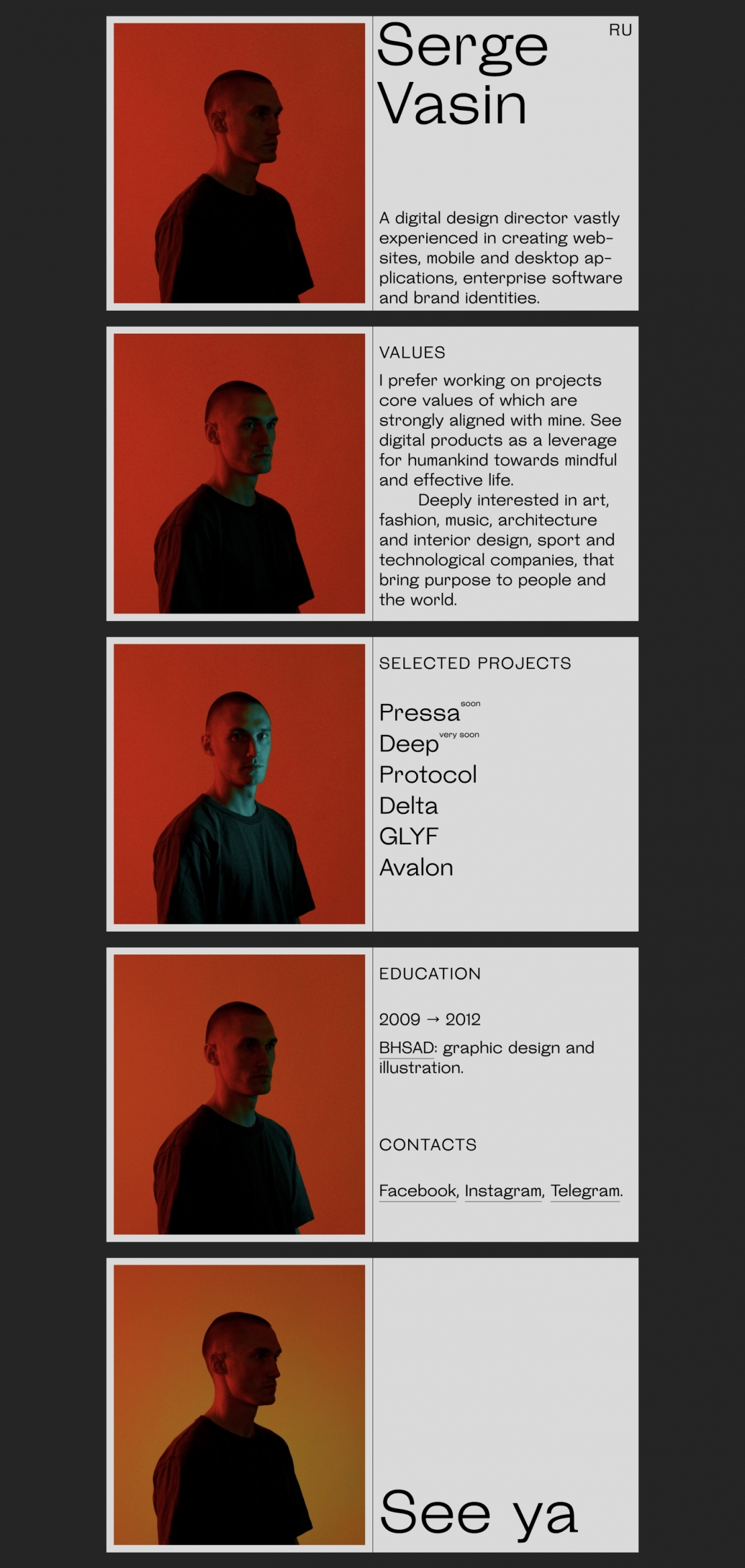
Serge Vasin Сергей Васин
This work
in other
nominations
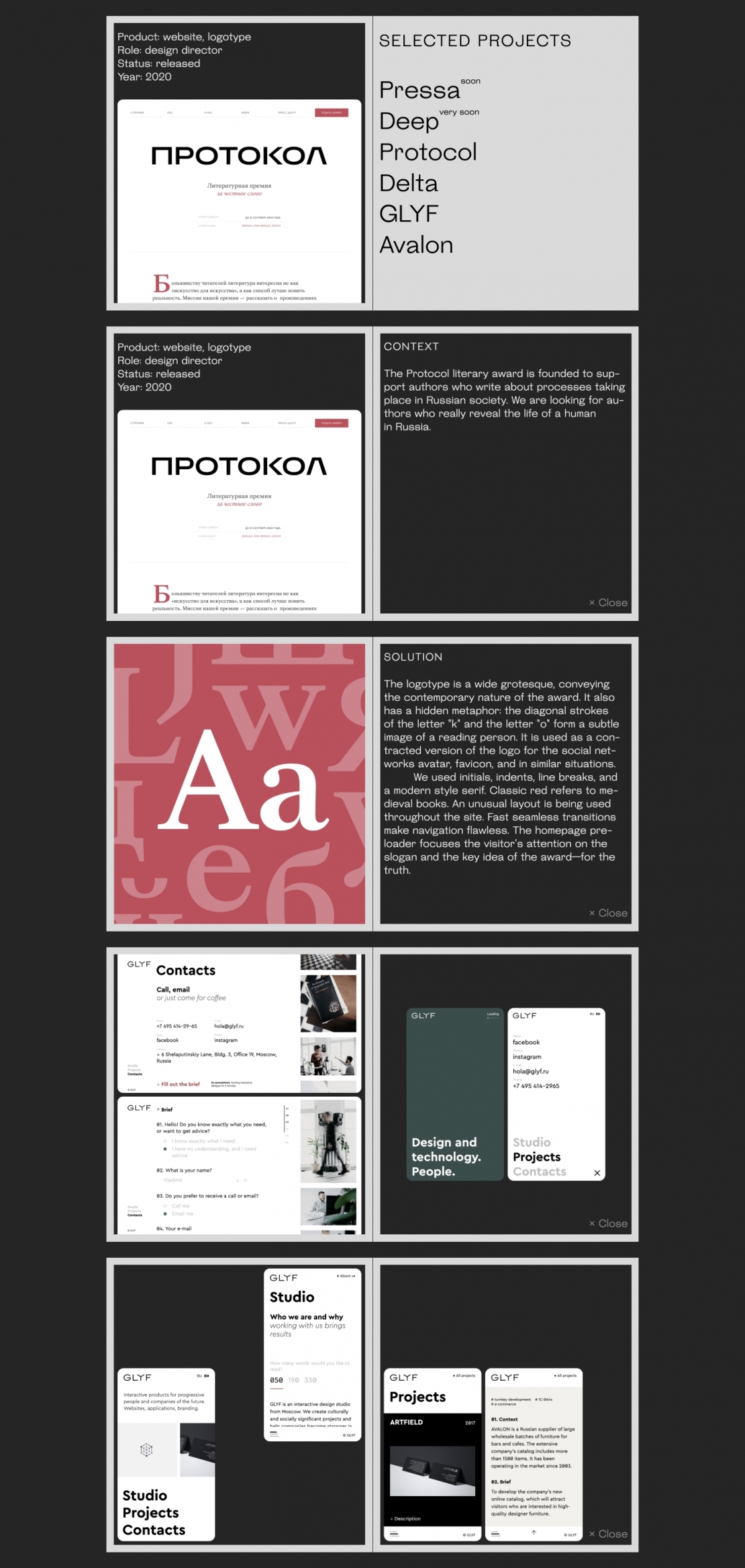
Websites Design
Task
To create a simple and interesting website for a design director.
Ideas and solutions
The majority of modern design portfolios are faceless: animation, trendy typography tricks, case studies, contact information. There is no connection with the authors, often not even a static photo. I wanted to bypass the most and do otherwise. I determined that a large portrait fixed on the screen should be a central element alongside my history and works samples. Since I was making a full story about myself, not just screenshots of graphics, the text took up a lot of screen space. The user could get bored, so I decided to add dynamics to the portrait. The original idea was to have a spot of light moving against the frozen face and body. Active movements of the body and head were not supposed—this could distract from reading. Easy light manipulation seemed to be the optimal approach. I wanted to make an analog effect, which will be filmed on camera and tied to the native scroll because the Internet is full of heavy WebGL and JS animations, which many people, including myself, are tired of. Moreover, I was making the site personal and humane, so the graphics created by real physical light was good for the concept. While searching for a suitable movement in the frame, I found that an easy turn of the head towards the visitor gives an unexpected, a bit creepy, but very interesting effect of the sight of a person. It became clear—this is a great delivery of the core idea, because what can give a greater sense of communication with a person than eye contact? The Steinbeck font also emphasizes analog graphics and lively look-and-feel. Here is what Roman Gornitsky, the font creator, notes about it: "In Steinbeck, many of the occurring inconsistencies were kept (and many were made intentionally): without fanatically collecting curious deviations, but rather with a healthy disregard for digital precision tools. The resulting typeface produces irregular and uneven, but (most important) lively typesetting".