Chaika Храм Артем
This work
in other
nominations
UX, UI & Journey Design
Task
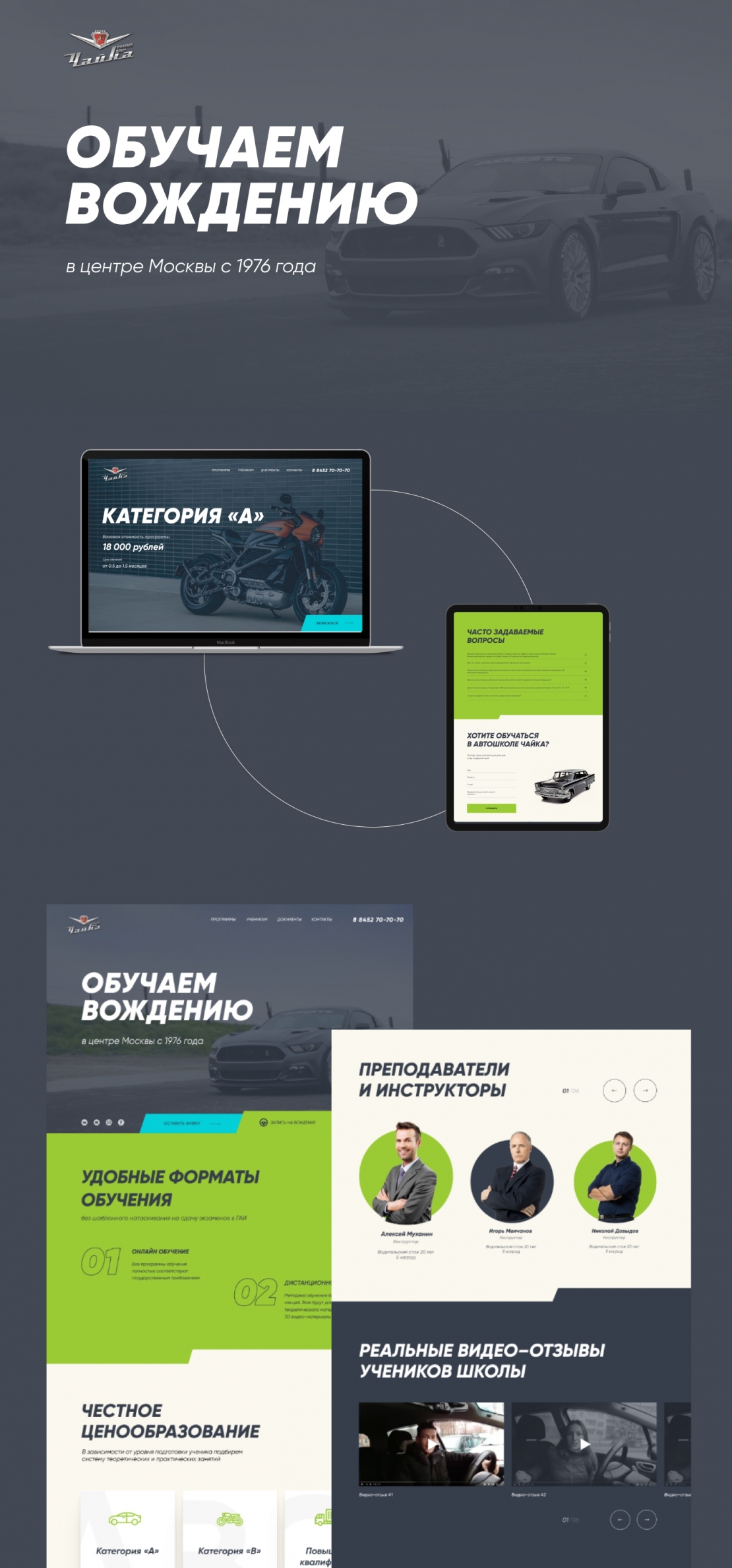
The driving school “Chaika” has been working since 1976 in the center of Moscow. The mission of the company is to prepare the responsible and stress-resistant drivers. That’s why the psychology lessons, the premedical first aid lessons and right behaviour in accidents lessons were included in the curriculum. The clients of the company can also choose online training courses, but the practical part of the lessons take place at the updated in 2018 autopark. For the sustaining the brand image the
Ideas and solutions
15 out of 20 driving schools have only basic cost of driving courses on their websites, which is not enough for taking out drivers’ licence. 16 out of 20 driving schools use the red colour mostly 17 out of 20 driving schools work according to the standard definite programs and do not take away lessons that the client has already known. These conclusions formed the basic structure and content presentation. The company's comprehensive training program and pricing have become central components of the site. We used green as the accent colour to stand out from the competitors. We post the schedule and the enrolment on the first screen for the clients’ quick access. We emphasized the main advantages of the company on the main page. We rewrote the texts, abridged ⅔ of their length and left only useful information for clients.


