Akira Goods Кристина Анфалова
This work
in other
nominations
UX, UI & Journey Design
Task
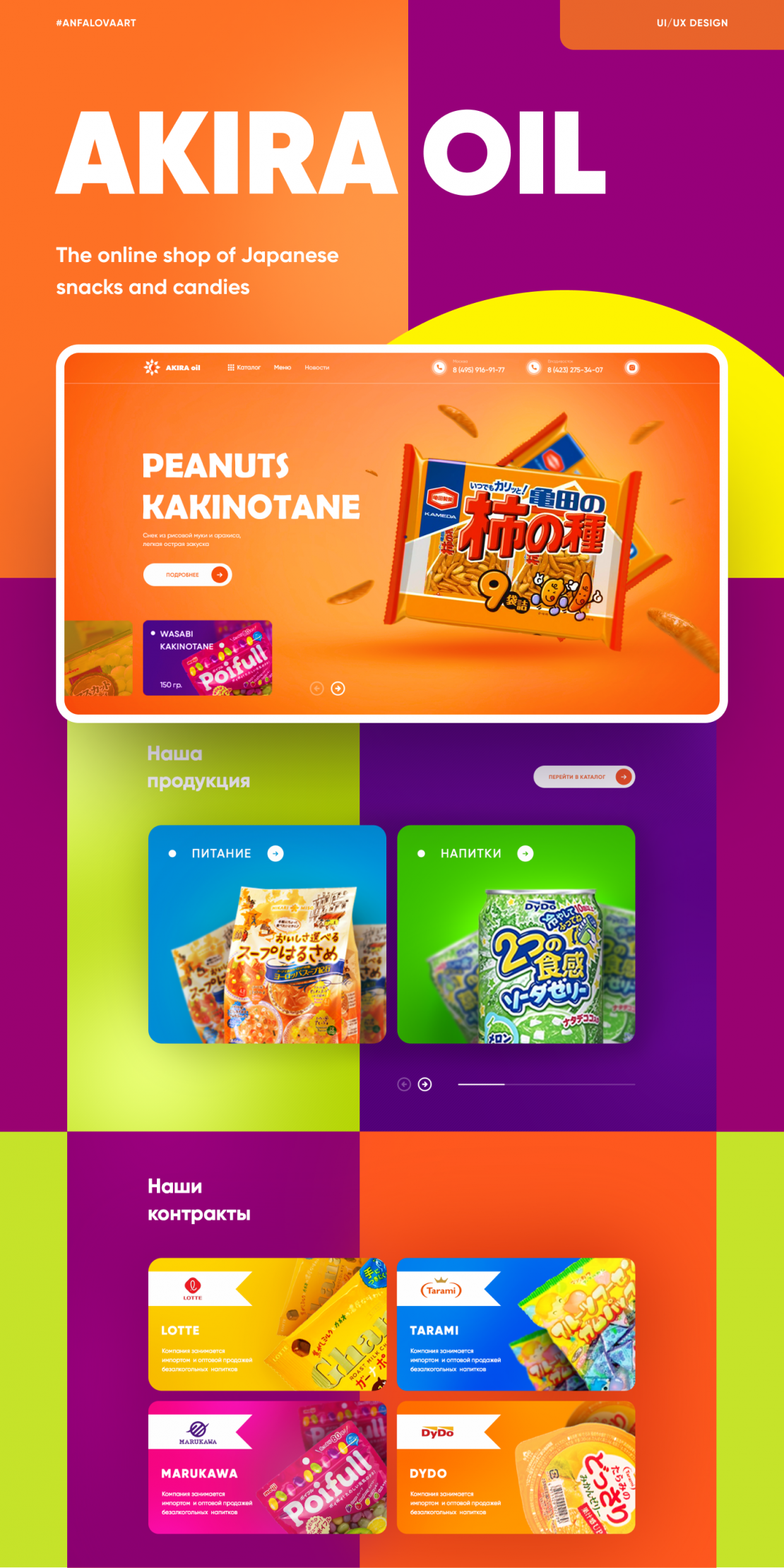
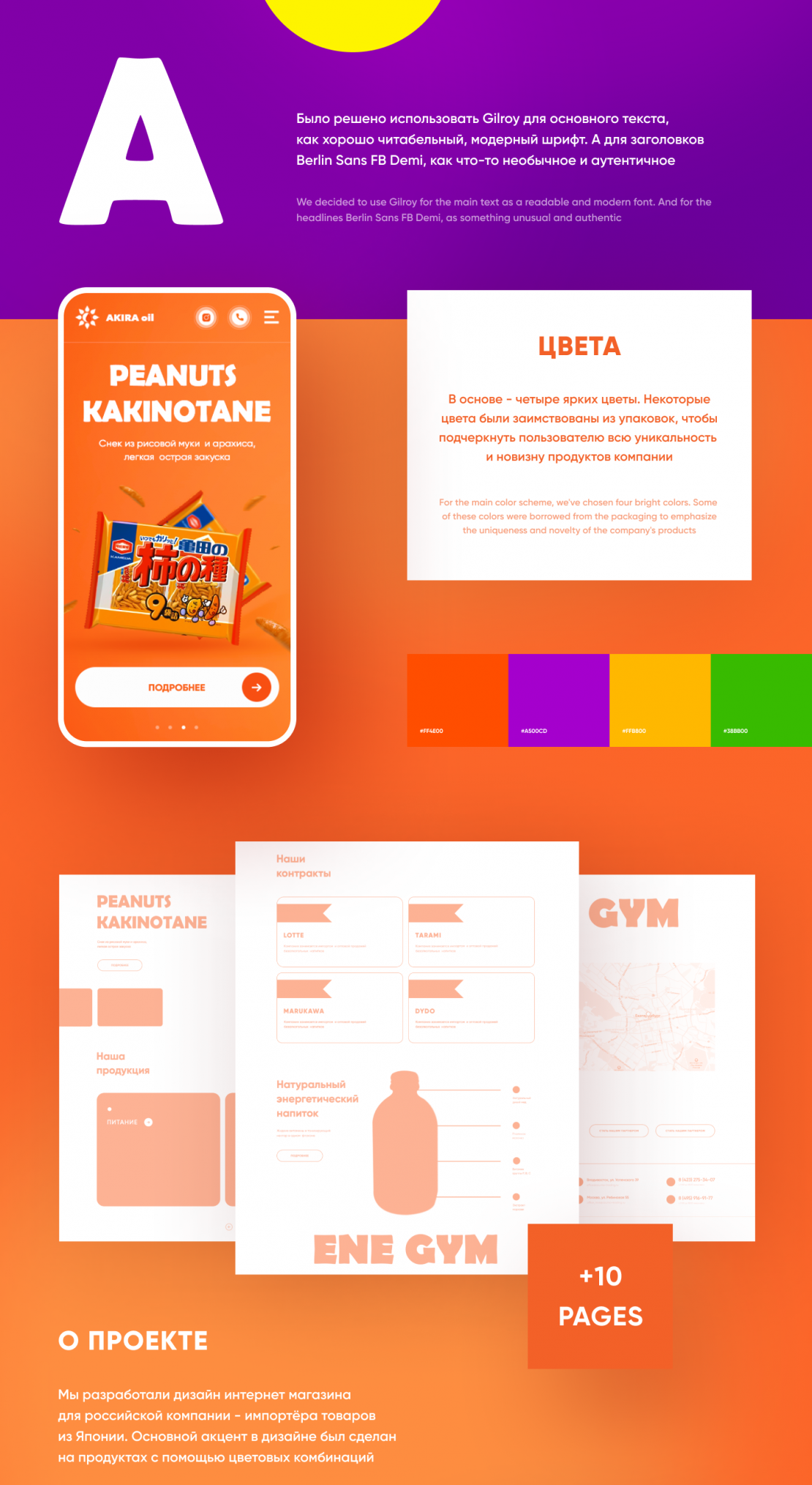
The desire for harmony, integrity of nature and man, as well as a thoughtful approach to life allow the Japanese to create delicious, healthy, sometimes special products, the quality of which is indisputable all over the world, so the main task was to make a design corresponding to Japanese products - bright and unusual, standing out among competitors in the Russian market. The design of the new site should work for the company's reputation, increase interest from consumers, as well as the b2b
Ideas and solutions
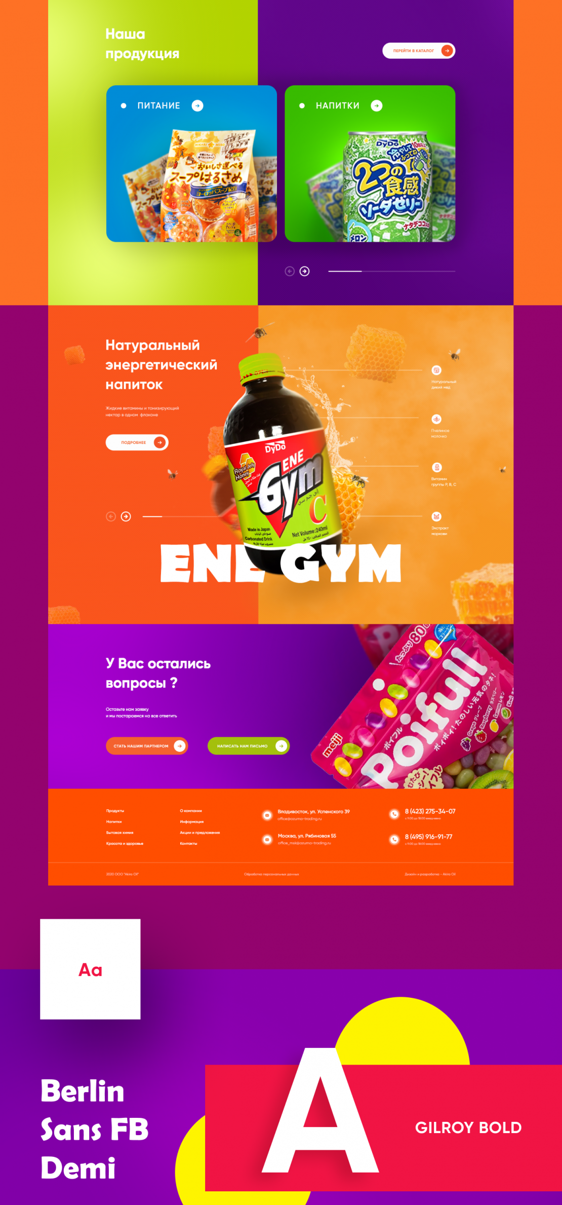
Akira positions itself as one of the most reliable and oldest importers of high-quality automotive products, food, cosmetics and household chemicals from Japan. The site design visually reflects the essence of the company and Japanese products. Bright large objects to attract attention and keep it on the most important thing. The site structure was formed based on the analysis of the target audience - what can primarily interest the buyer-the catalog, the products themselves, and contracts that inspire the audience's trust.


