SPECIA Nimax
Task
SPECIA is an association of digital agencies based in St. Petersburg. It currently has more than 50 members, including digital marketing agencies, web design studios, and digital product design companies. The association’s members share a few things in common: they’re based in St. Petersburg, work in digital media, and value open and amicable relationships between digital market players. Our task was to update the association’s visual identity.
Ideas and solutions
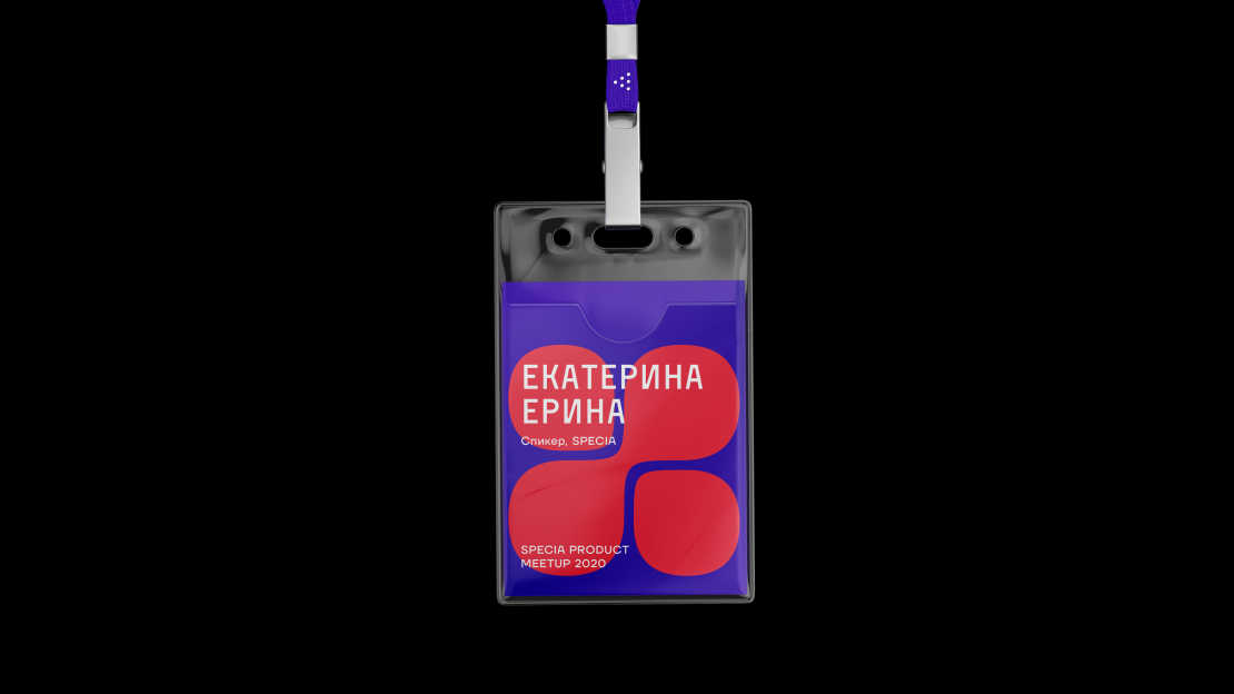
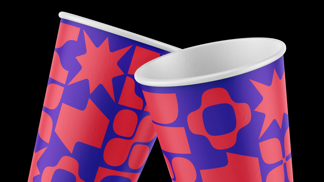
SPECIA was founded in 2013. The concept behind the association has been tweaked a few times since then, but SPECIA’s branding has never changed. Originally, SPECIA’s members were all agencies. Now, its focus has shifted to product design and adtech service development. The association’s updated branding had to reflect these changes. It was also important to create a set of visual elements that could be combined, making the branding easy to apply. Earlier in its history, SPECIA began organizing meet-ups for designers, project managers, developers, and marketing experts. Over time, a web of trends and formats emerged which formed the basis for the brand’s visual language. Visual Identity Concept SPECIA’s new visual language is based around the principle of “the same, but different.” The association brings programmers together with SMM experts, lawyers together with content managers, and designers together with heads of agencies. We drew geometric figures to represent each profession within digital marketing. For example, our “project manager” symbol reflects the moment when a client contacts an agency, where the project manager plays the role of intermediary, and our “agency manager” symbol conveys the manager’s role as the person who bring all the departments in a company together. SPECIA’s original logo was a set of dots that represented the association’s hierarchy, but also conveyed that all the elements were equal to each other. It also evoked spices, in keeping with meaning of the brand’s name in Russian. The logo is a recognizable brand asset which we wanted to keep, so we decided to modernize it. We made the dots in the logo squarer, so they are shaped more like the symbols representing the different professions. The logo’s text was drawn by hand. We refreshed the brand’s key colors, red and dark blue, increasing their saturation and brightening up the red to make the new color palette more vivid.