New European Theatre festival ESH gruppa
Task
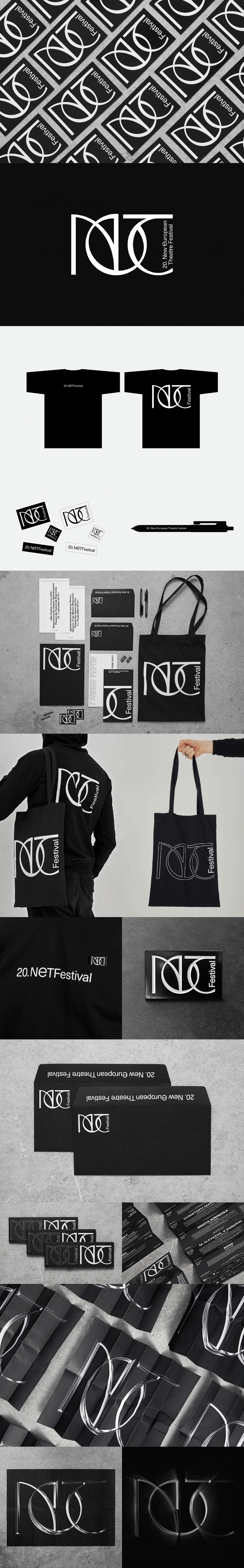
New visual identity for NET Festival (New European Theatre). The festival was established in 1998. Since then the main goal of the festival was to promote modern art among russian audience. For it’s 20th anniversary NET decided to update the identity and create a consistent visual style, that did not exist previously.
Ideas and solutions
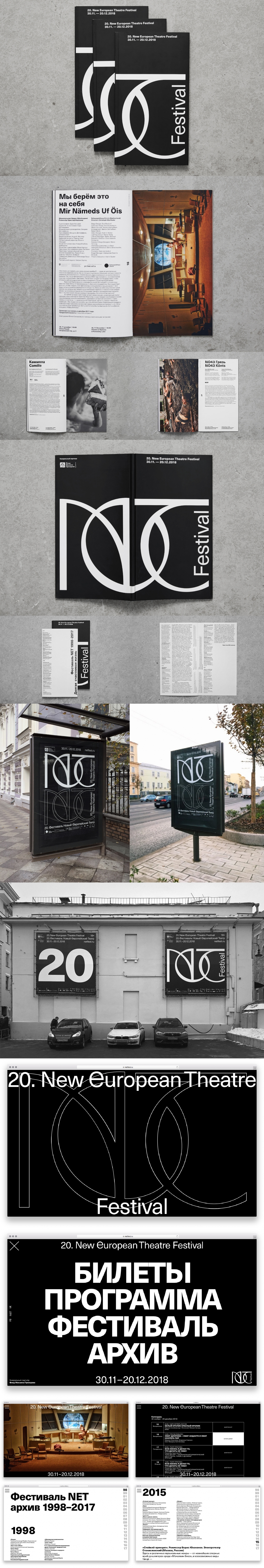
The new logo has three size variations: the “S” size is for compact spaces like social media, “M” is the basic version, “XL” is for large formats, e.g. billboards and clothing. The digits in the title (20.) stand for the current year of the festival. The sign works great with or without photo / video content. We have developed the system that allows to update the key visual every year while keeping the logo and basic identity elements in place. The new identity was presented as a manifest — bold white typography on black background. After all we reached two main goals: to establish the identity system for the future festivals and to emphasize the style update and 2018 festival’s programme.