Check in Chicken Dark fast food Bistro Дизайн-студия Мы
Category
Branding and Communication Design
Nominations
Logo
Company
Check in Chicken Dark
Brand
Check in Chicken Dark
Link
Task
Branding development for an American fast food chain where you can try special chicken dishes that can be rarely found in Russian food courts
Ideas and solutions
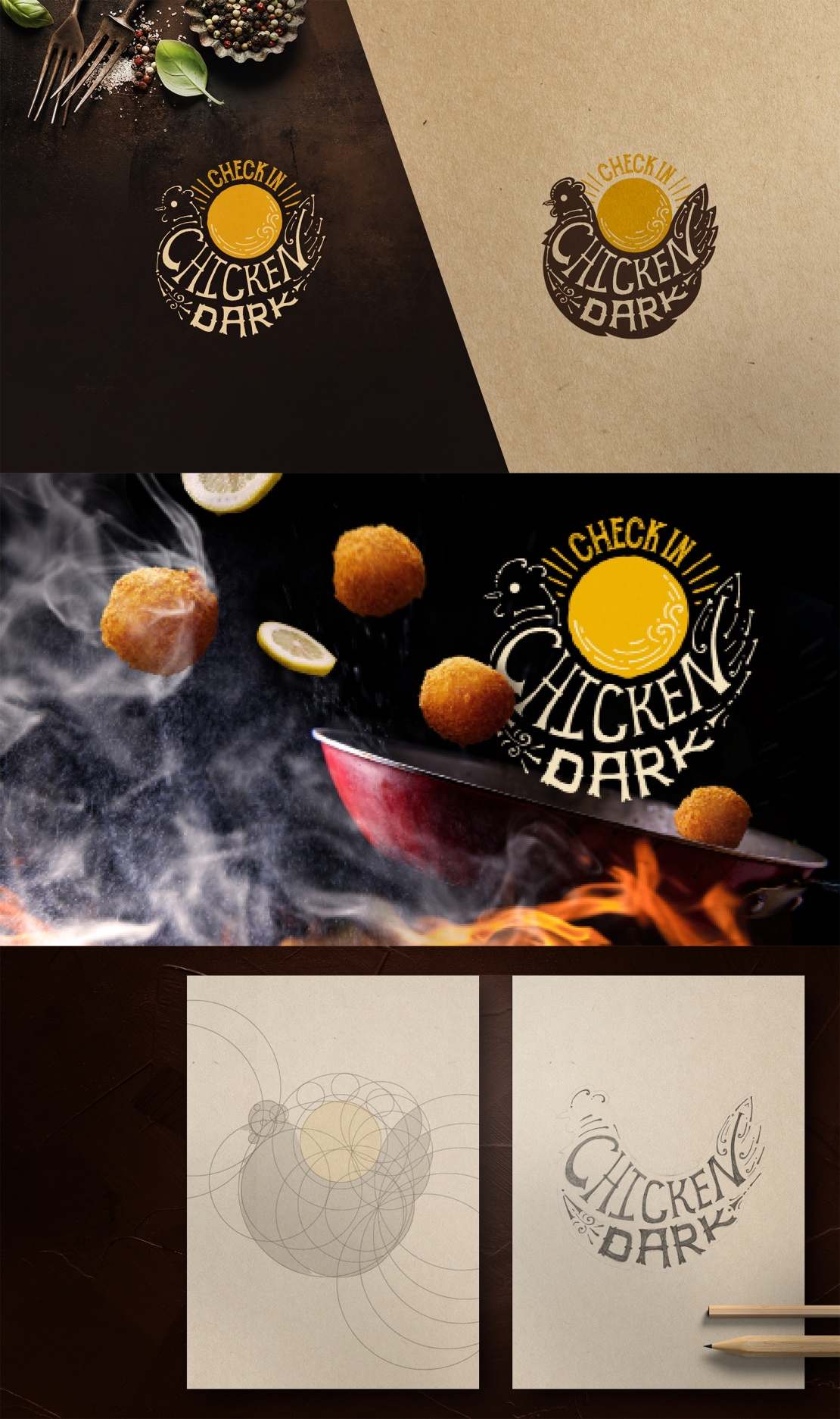
The Dark Chicken flirts with the background: when the background is dark the body merges with it, leaving only the outline — the pattern with Letters. Looking a bit closer you can find that the pattern consists of the small bones. And when the Chicken is on the dark background only it's skeleton remains. The idea is: "So delicious that only the bones remain!" We have built the shape of the Chicken according to the proportions of the Golden Ratio and then hand drawn the letters and patterns inside the form. While creating the pattern we were inspired by the drawings of native Americans — Indians.


