Site of animation and design studio Keyframe ltd Ключевой кадр
Task
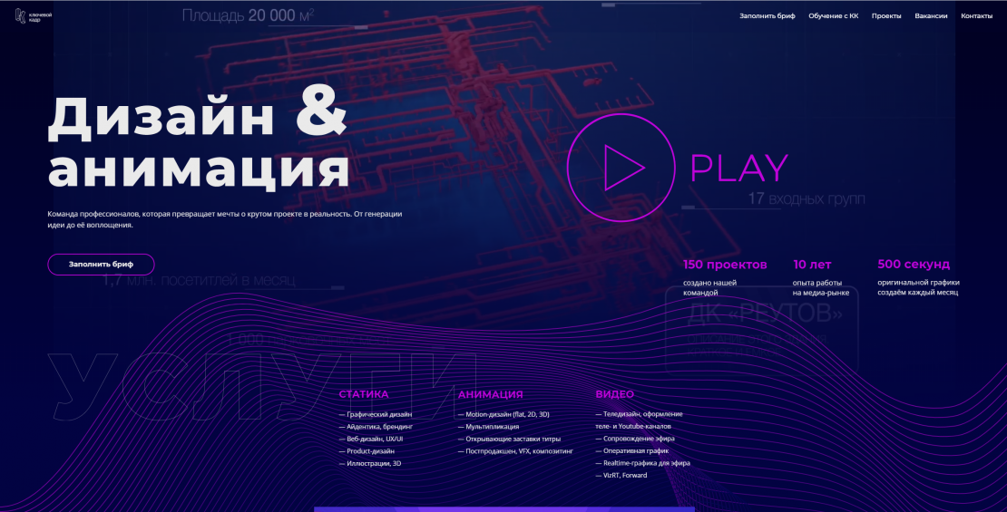
Goals and objectives of the project - to make a website that will: a) immediately report on the main activity of the company from the main page b) demonstrate the style of the company c) competitive against the background of other sites of competing companies d) demonstrate our professionalism and skill level to the client
Ideas and solutions
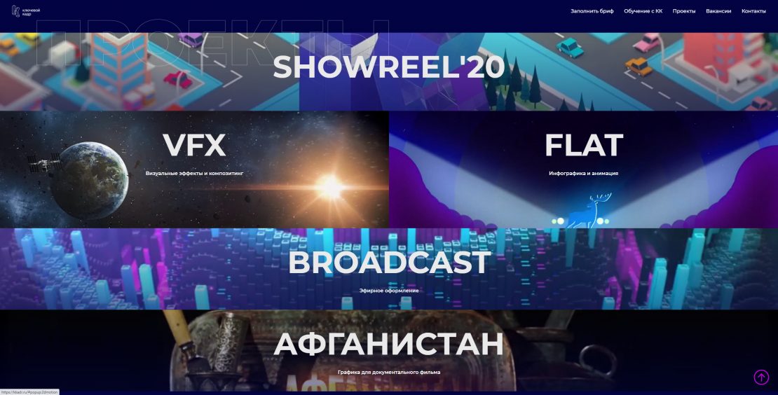
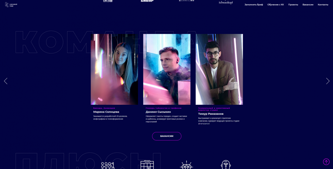
An analysis of competitors' sites was carried out, after which we found that other animation studios are not chasing fashion, but are trying to create their own unique visual style. Further references were collected: we decided to make a visual style focused on neon - it is associated with the era of the 90s and at the same time takes us to the future. Also, neon can be combined with modern objects and antique sculptures. A site with a dark blue background that emphasizes solidity, with bright purple elements for illustrations, buttons and some subheadings. It has many interactive elements. On the home page we are greeted by a showreel in the form of a background video, which shows the main activity of the company - motion design. The Instagram feed is also integrated, which shows our current cases, image projects and the latest company news. And even the photo session of our team was held in a special studio with neon light to maintain a style. After finishing work on the site, we talked about it in social networks and began to link to it on all our viral works. The result is rave reviews from colleagues, increased sales, and competitor envy

