Canonpharma Валерия Репина
Task
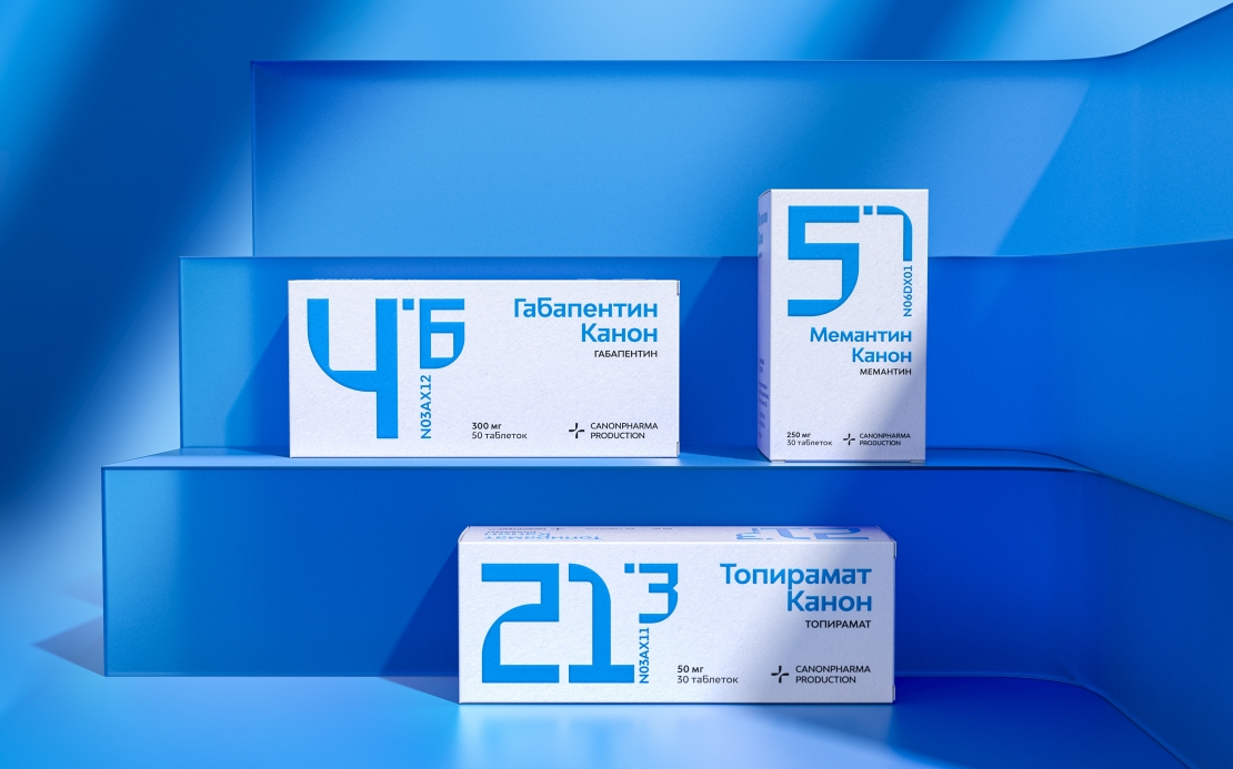
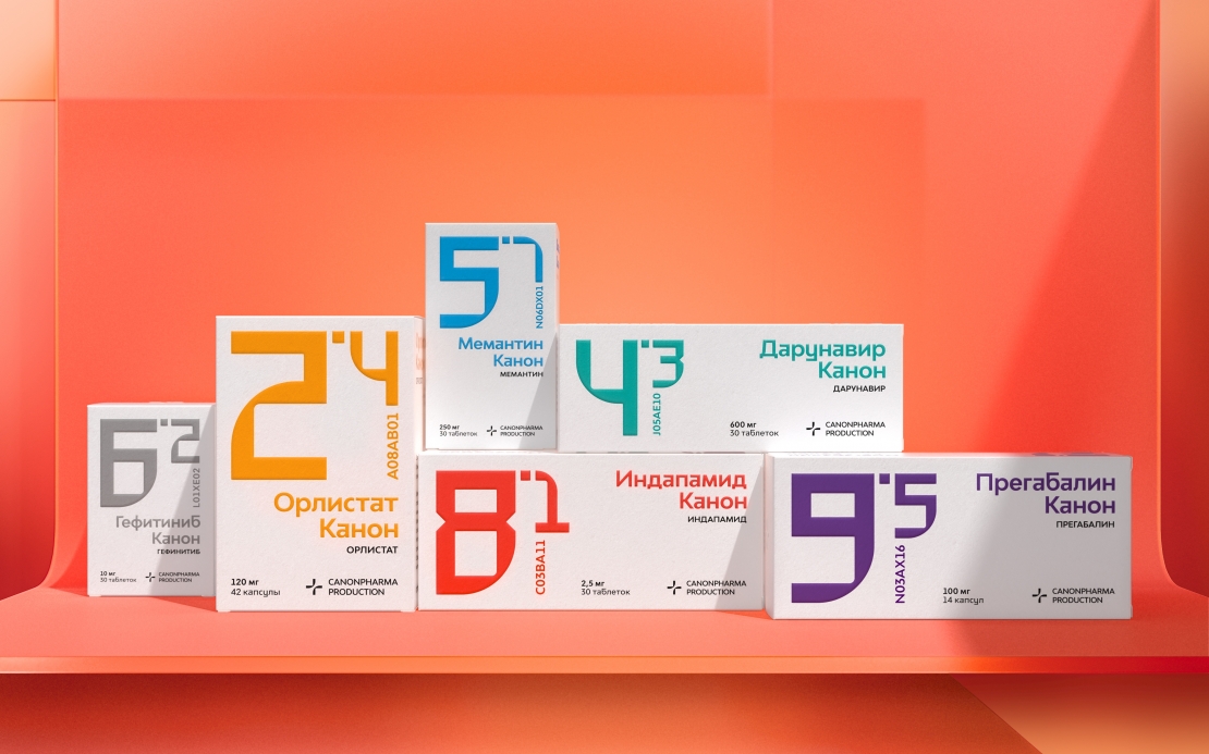
The key problem with generic drugs is that they have no unique features and it is very difficult for a consumer to distinguish between products, while pharmacists find it hard to locate a particular drug at a warehouse, as products by different manufacturers have identical names. Meanwhile, the manufacturer often finds a large variety of drugs confusing and does not know how to package new products.
Ideas and solutions
We have developed a groundbreaking system that enables easy navigation among a multitude of drugs and dosages, based on color coding and numbering. We assigned a unique color to each pharmacological class and organized lists of all drugs within each class. The first digit stands for the drug number within the pharmacological class, while the second digit after the dot indicates the dosage. This way the patient can simply name the group and number to the pharmacist. We paid great attention to the look of the digits so that these are clearly legible while bearing unique brand identification traits. Built on the contrast of hard and soft shapes, they reflect the idea of advanced technologies united with customer care. The design in this project has acquired its true meaning - it is discreet, and it does not distract from the essence while solving people's problems.