«Tom Yum Moscow» chain of street food corners Heylook bureau
Task
The client requested to develop a brand for «Tom Yum Moscow», create a logo, provide branding in contact points. However a strict requirement was set — to stay within a traditional color grade of the product.
Ideas and solutions
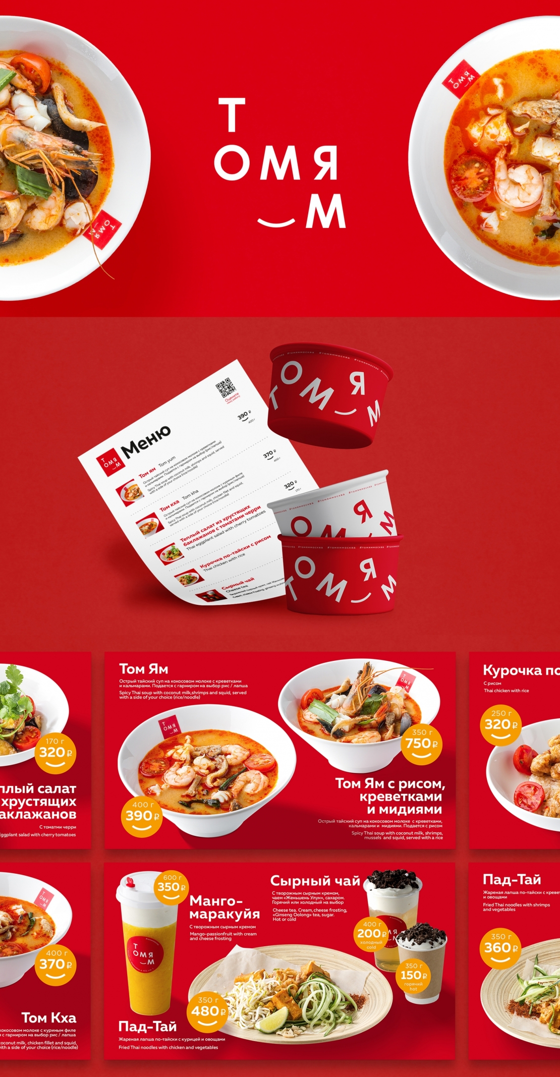
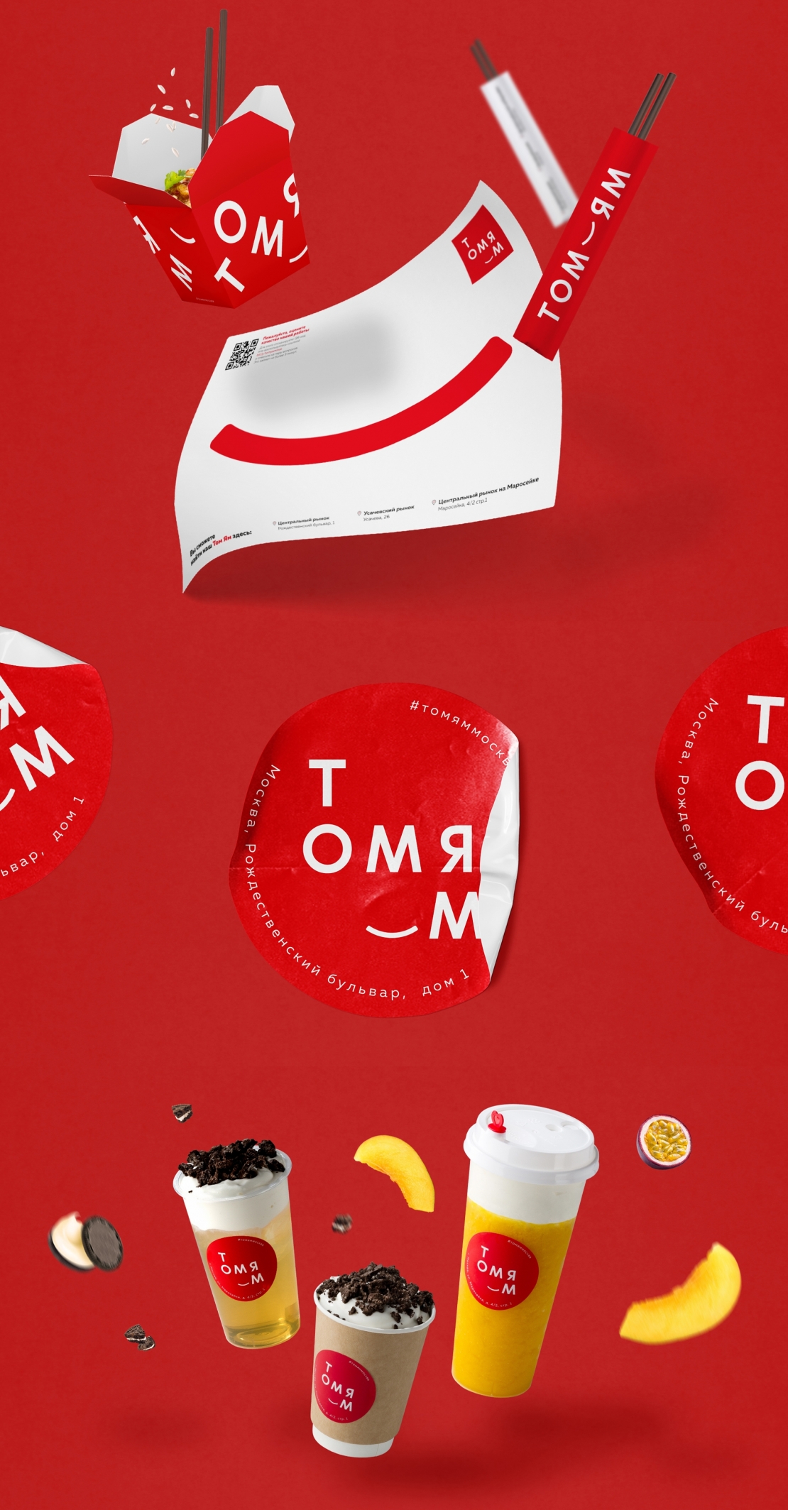
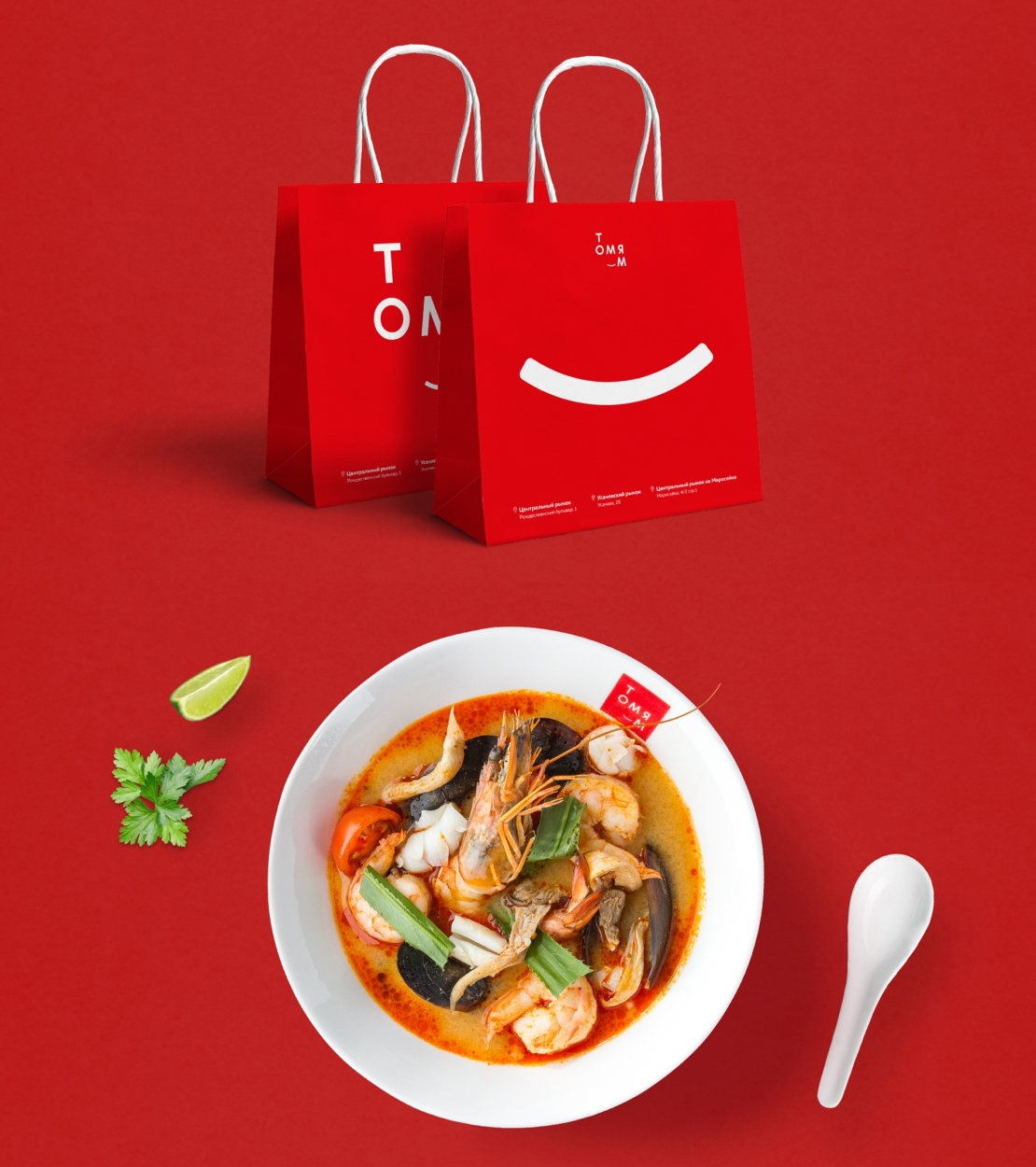
A logo was created, which was a metaphor for a smile of a man who experienced rich, unforgettable taste of Thai soup called Tom Yum for the first time. It is an expressive and smiley logo, which is well perceptible on items and stays noticeable even on small products. A corporate identity was developed, which helps to create cheerful minded atmosphere in places where «Tom Yum Moscow» corners are situated. Over and above the bright corporate identity helps to pay attention to brand messages at the same time meeting the requirements of promotional items usage imposed by food-court administration. We designed the package and dishes, developed printing layouts, an animated menu for digital signage, created uniform for personnel and front interiors for corners situated on the main market in the center of Moscow — «Central Market» on Rozhdestvenskij Boulevard and Marosejka.