LIQUID & LIQUID / Package redesign Фоминых Артемий
Task
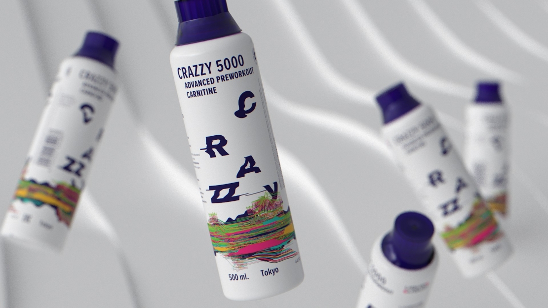
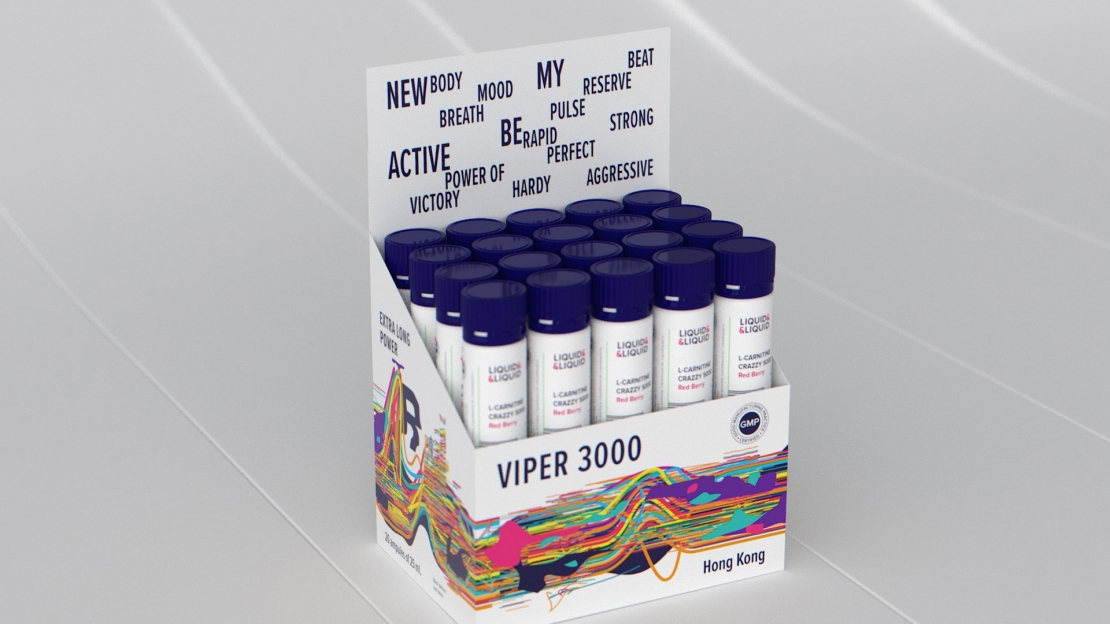
Liquid & Liquid is the manufacturer of liquid sport nutrition from Germany. L&L products are chosen by those who want to get more from themselves and their bodies. For their new audience, L&L offers a new multi-component product that requires a fundamentally different approach to design as compared to the standard sport nutrition. We had to develop a package design for the new product range promoting sport not as a physical activity but as a special way of life.
Ideas and solutions
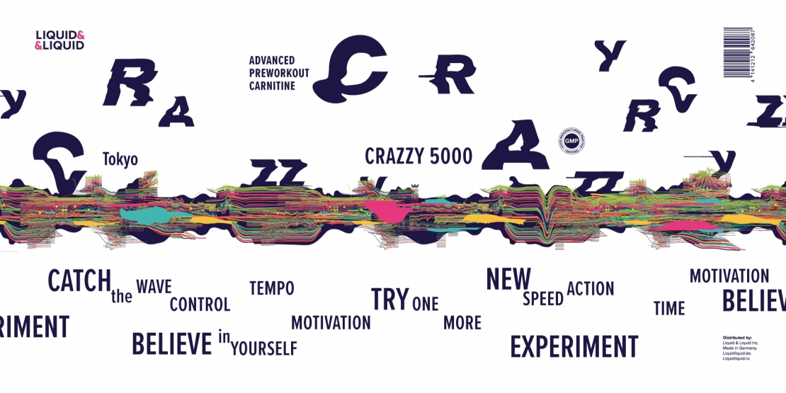
The L&L audience includes those who live in a big city rhythm: they get out of their home for a run at 5 o’clock in the morning, visit round-the-clock gyms, practice outdoor crossfit. It is a new generation of consumers who do not need sports nutrition as such but require full support for their lifestyle. Imagine: in your bag, near your favorite pair of trainers, there is a bottle filled with energy, charged to win. This is not a workout background, not a preparation; it is the very spirit of the movement, a quintessence of your wishes and mood, a bright pulse of a new life. We spirited smooth lines of the initial Liquid & Liquid image while turning them into a rhythm, a sound, a movement amplitude, lines of a big city that never sleeps and never gets tired. Away with boring cherry and citrus! Now you can try Moscow, take a sip of Hong Kong, taste Shanghai, Berlin or Paris. Liquid & Liquid is a brand that is different from others. It is impossible not to notice it; its appeal is the color vibration, a visual scream, a revolution coming from inside. A rebellion against obsolete thoughts, against a lifestyle which weights down, and against all that chains the freedom. Bright. Dynamic. Provocative. Who needs goodies? We break the mold and turn it into a visual manifest. Faster. Crazier. More.