“My Tele2” mobile application e-legion
This work
in other
nominations
UX, UI & Journey Design
Task
My Tele2 app is used as a channel to connect the company and its customers. Tele2 telecommunication company uses the application to resolve its service, product and communication problems. Our goal was to continuously improve all three areas through the use of the mobile app.
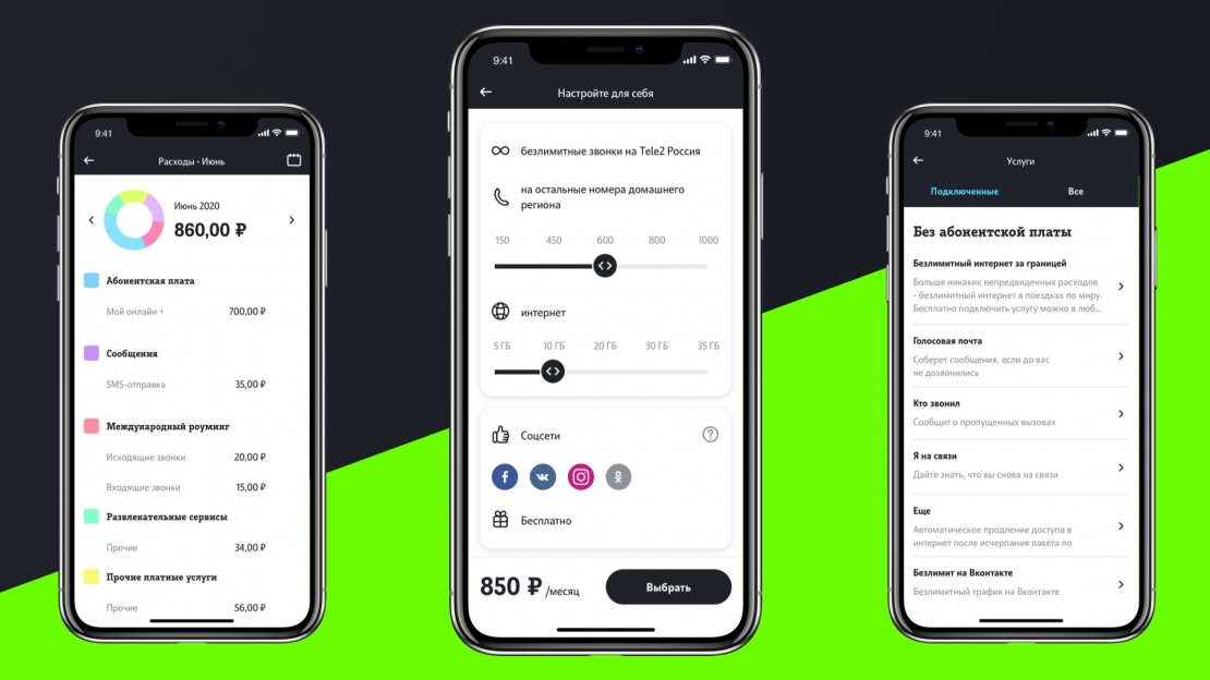
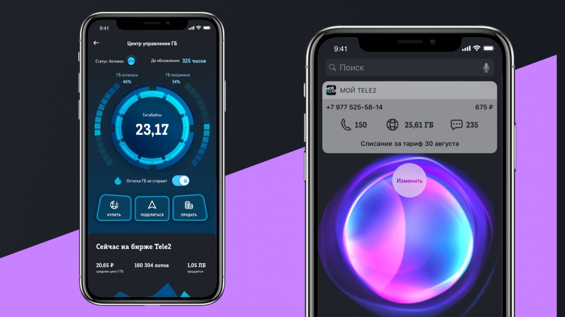
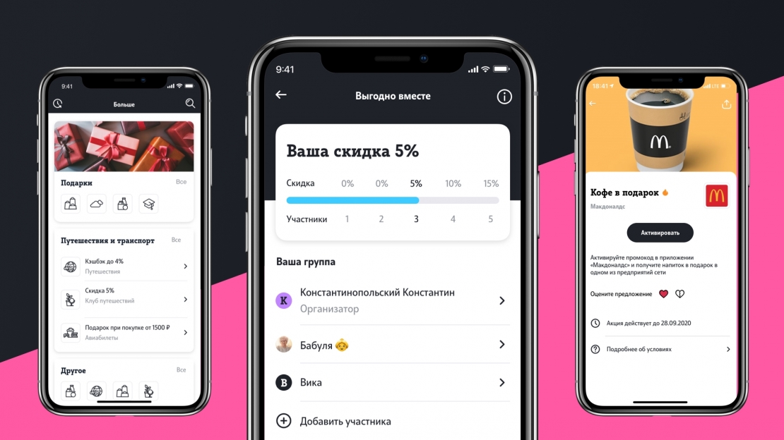
Ideas and solutions
Solution: consistent functionality improvement without manageability loss. We have been focused on the app's appearance and user experience rather than on functionality extension. We have achieved this through the redesign of the navigation. We have reduced that section up to only three buttons and gathered all the settings into the Profile section. Considering the most demanded user scenarios and Tele2's business goals, we have divided the screen into several functional zones. We have highlighted core functionality and made IT more accessible to users. For example, now topping your balance up is just within the reach of 2 taps. We’ve redesigned subscription and pricing options pages. We have used the best cross-industry UX/UI practices to improve performance. Banking apps’ classic card swiping turned out to be a perfect solution for switching between numbers. Every card now offers a preview with all the necessary information: subscription price, balance, minutes available and date of the next billing. When the card is tapped it leads the user to the My Subscription screen displaying detailed information. Android widget demonstrates the same card design as the one in the application. We’ve enhanced customization. Now every account’s card can be customized by color and name. Additionally, we have integrated the contact list, so if the number is saved on the phone as "Sweetheart", it will be displayed in the card. We have supported the gesture controls. Previously, the monthly statistics were available only in the calendar, but now it only requires swiping. We have predicted upcoming updates. My Tele2 first version was black and had an enormous app’s user fanbase. We considered that when creating the black My Tele2 version with additional improvements for iOS 13. We have added some emotionality into the app through interactive features like stories, WhatsApp and iMessage stickers, and postcards with panda suggesting to "Indulge yourself with 1GB".


