«Tyanem-Potyanem Pixies design studio
Task
Branding of Chinese noodle «Tyanem-Potyanem» Corporate identity development: - logo - identity - illustrations - packaging
Ideas and solutions
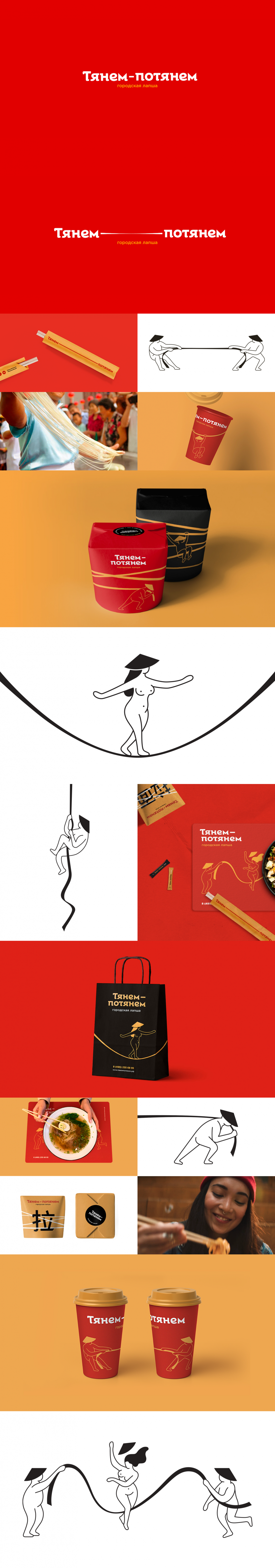
┬½Tyanem-Potyanem┬╗ ŌĆō Chinese noodle-bar at Moscow Central Market in Moscow. The brand name takes roots from the Russian folk tales, in particular ŌĆ£The Gigantic TurnipŌĆØ, in which itŌĆÖs numerous heroes ballsy try to pull the turnip out from the ground. In the Russian Language the brand name has strong association with the viscosity, which is inherent to the noodles. Moreover, phonetically it recalls the Chinese language: /tya-nem po-tya-nem/. This appears to be an important part of the concept, as the central reference of the project is l├Īnzh┼Źu l─ü mŪÉan ŌĆō the main dish of the noodle bar. We created the corporate identity for the restaurant, as well as set of amusing illustrations with funny fellows wearing traditional Chinese cane hats. They tug noodle of war (allusion to ŌĆ£The Gigantic TurnipŌĆØ), walk on it, and just play with it