coschooling "les rook" visual identity Елизавета Демченко
Task
Create brand strategy, naming and visual identity for coschooling, which would reflect alternative education values and principles. *Coschooling is a place for homeschoolers and other independent educational projects where they put the freedom to teach and learn their unique way into action.
Ideas and solutions
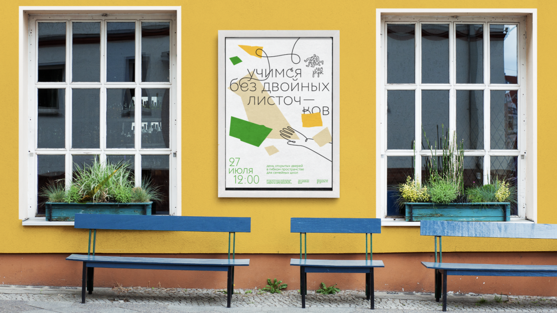
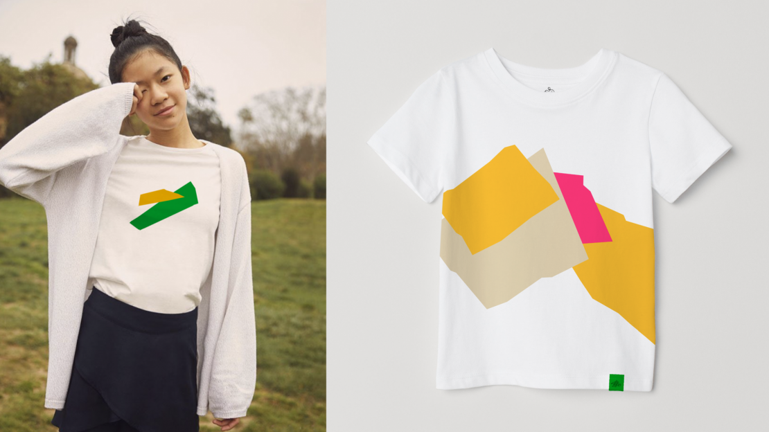
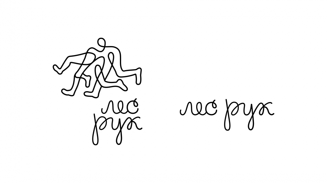
Project naming is based on the common phrase for Russian schools — [les ru:k], which is ironically said when a teacher asks class a question but no one raises a hand to answer. Literally it means “the forest of hands”. In public schools you’d rarely see such a “forest”, because children are not really interested in studying or frightened to say something wrong. But in coschooling it is common: everyone knows the answer or keen to guess. Or maybe they’re just playing, usually it’s the part of educational process here. It was important to put aside school clichés (both public and private) and communicate the pure joy of the process. The visual concept is based on the paper crafting which most of us enjoyed doing being a kid and not caring about marks. The idea of educational freedom is translated by composition principles, yet structured by typography (any educational approach needs some structure, right?). The tailor-made typeface and shifts in title layout create loose and playful feeling. Instead of “forest of hands” logotype represents running legs, because alternative education challenges traditional approaches. Motion, freedom, game — all these present in logo and should be in the education of future.